UX Terms
Introduction
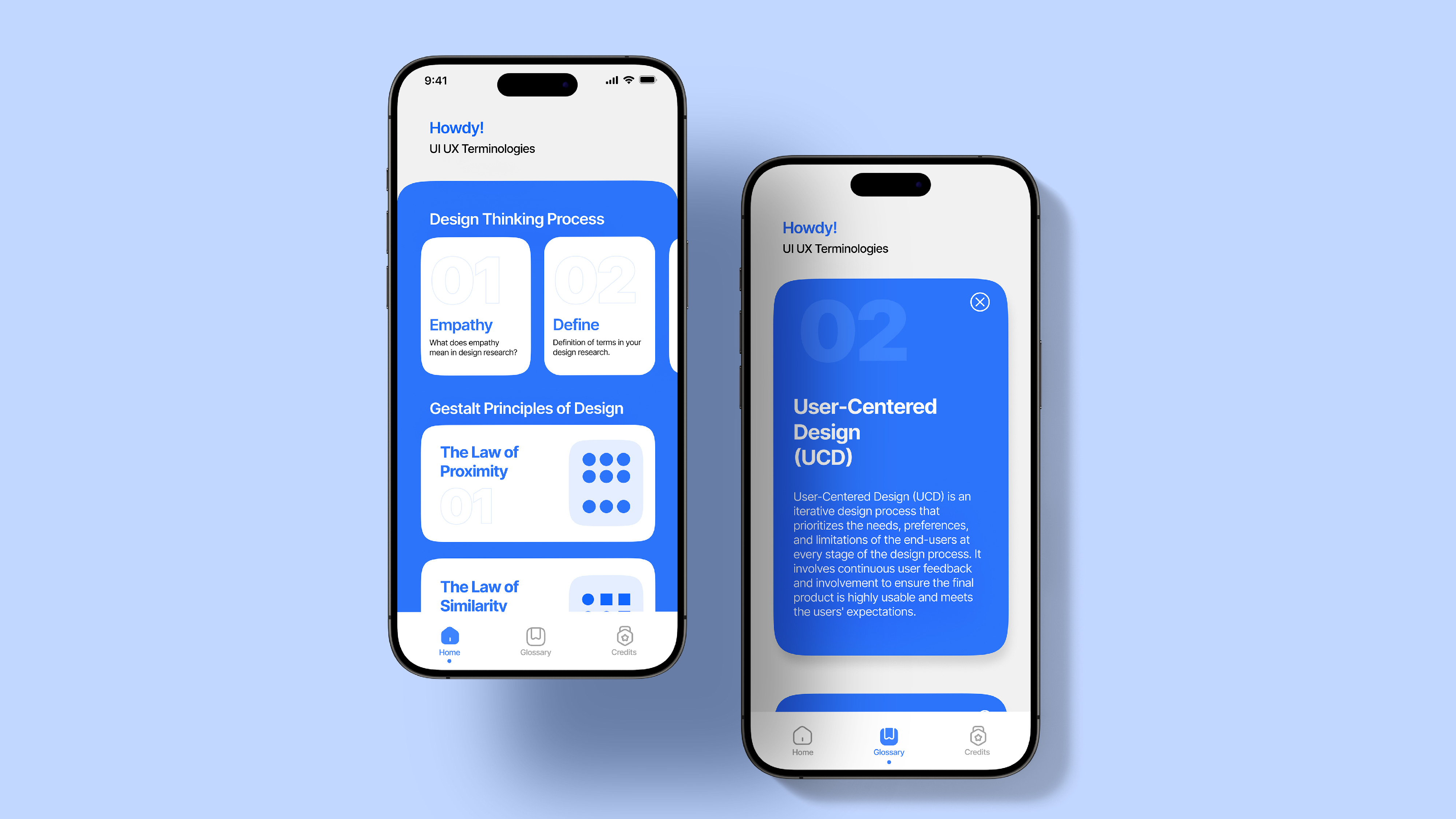
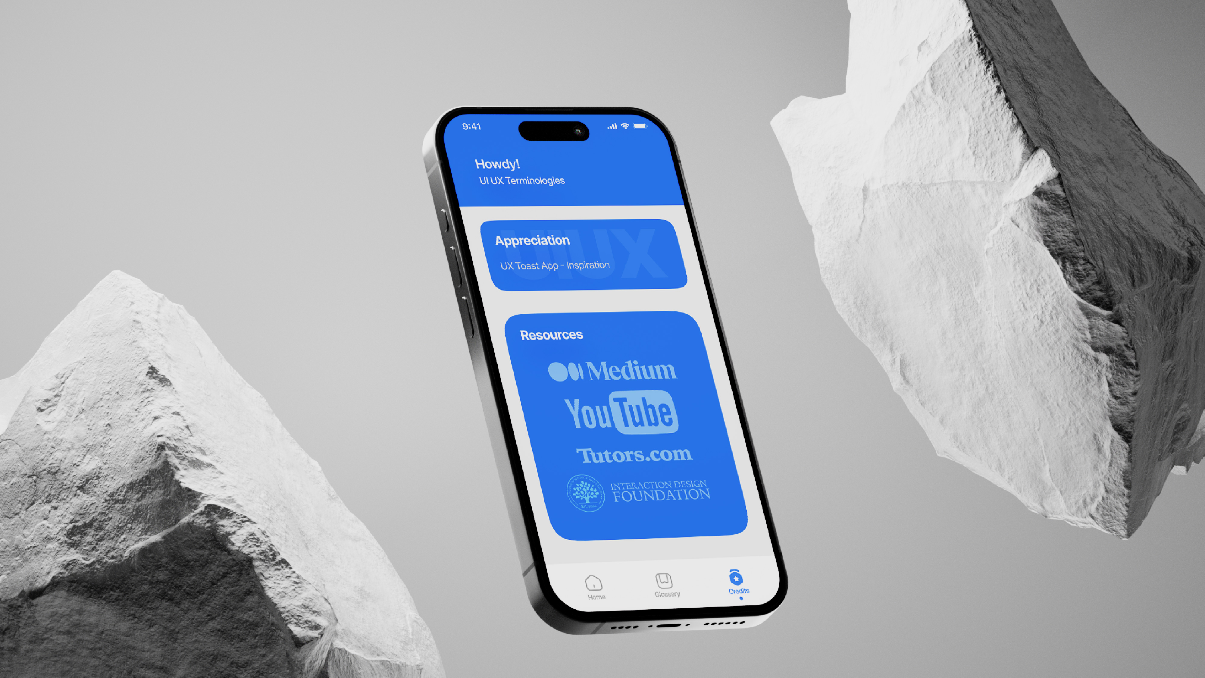
This project is an educational app tailored for college students and beginners in the field of UI/UX design. As an MFA student and teaching assistant, I created this app to address the common challenges students face when learning design thinking processes and Gestalt principles. The app features an intuitive layout with a Home section for step-by-step learning, a comprehensive Glossary of over 60 essential design terms, and a Credits section for transparency. Designed to mimic the ease of social media scrolling, the app provides an engaging, user-friendly way for students to build their design knowledge and confidence.
-
ProjectStudio Project
-
YearAug 2024
-
ToolsFigma, Adobe XD, Illustrator
Problem Statement
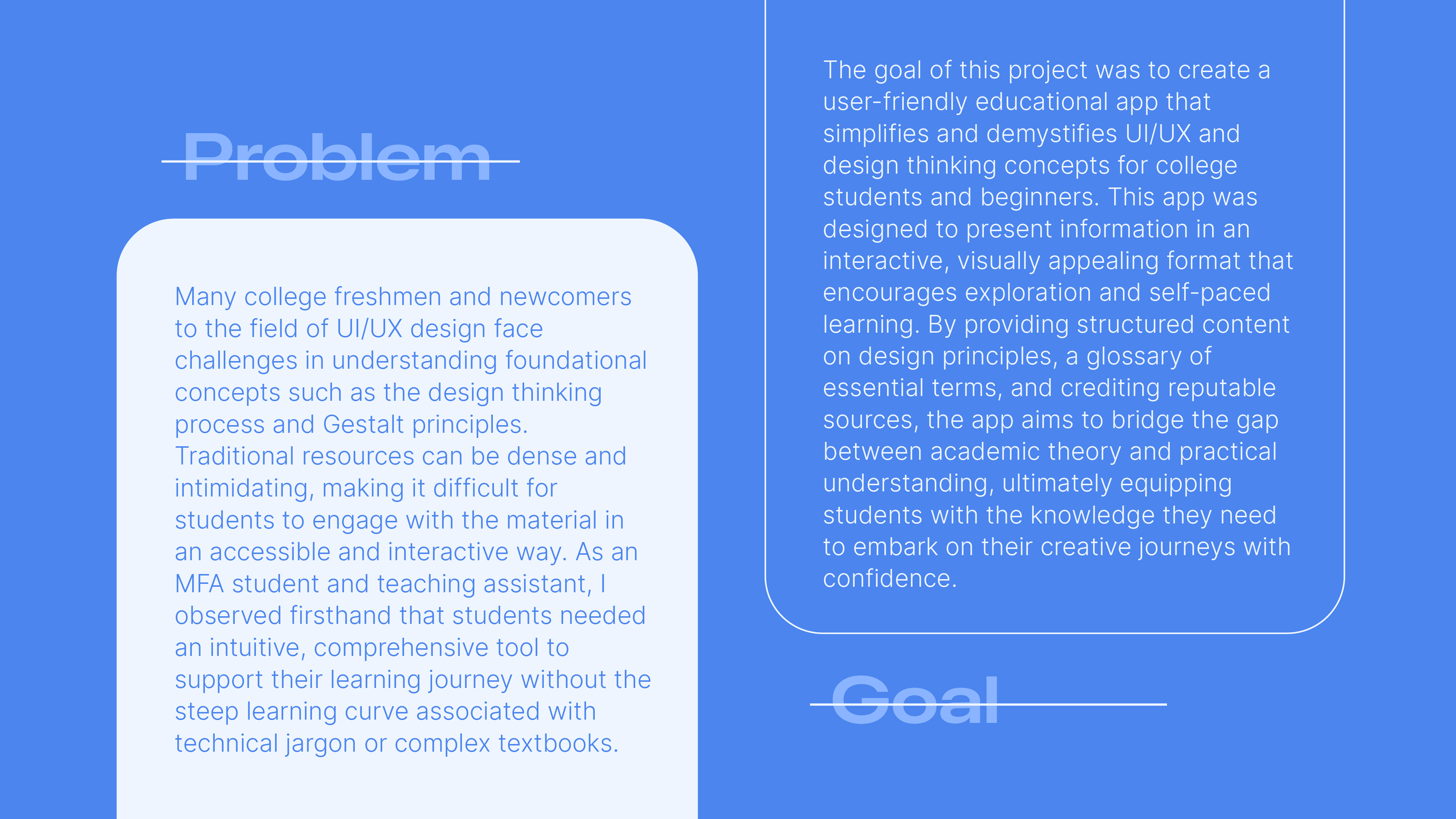
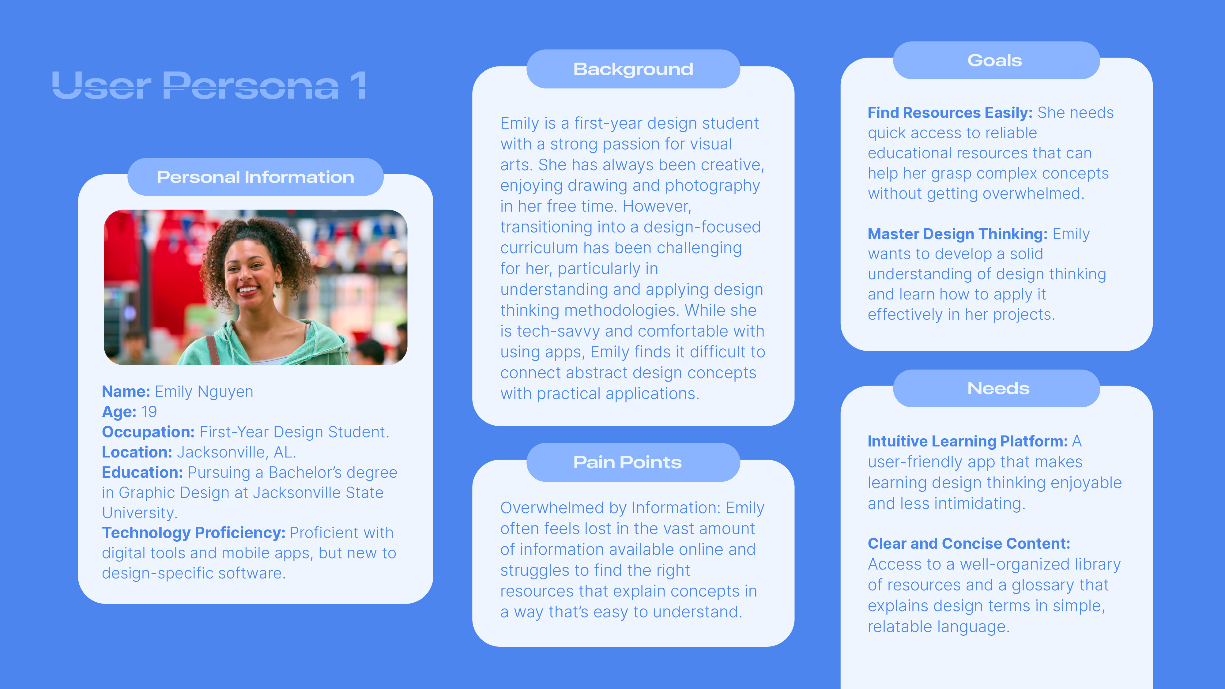
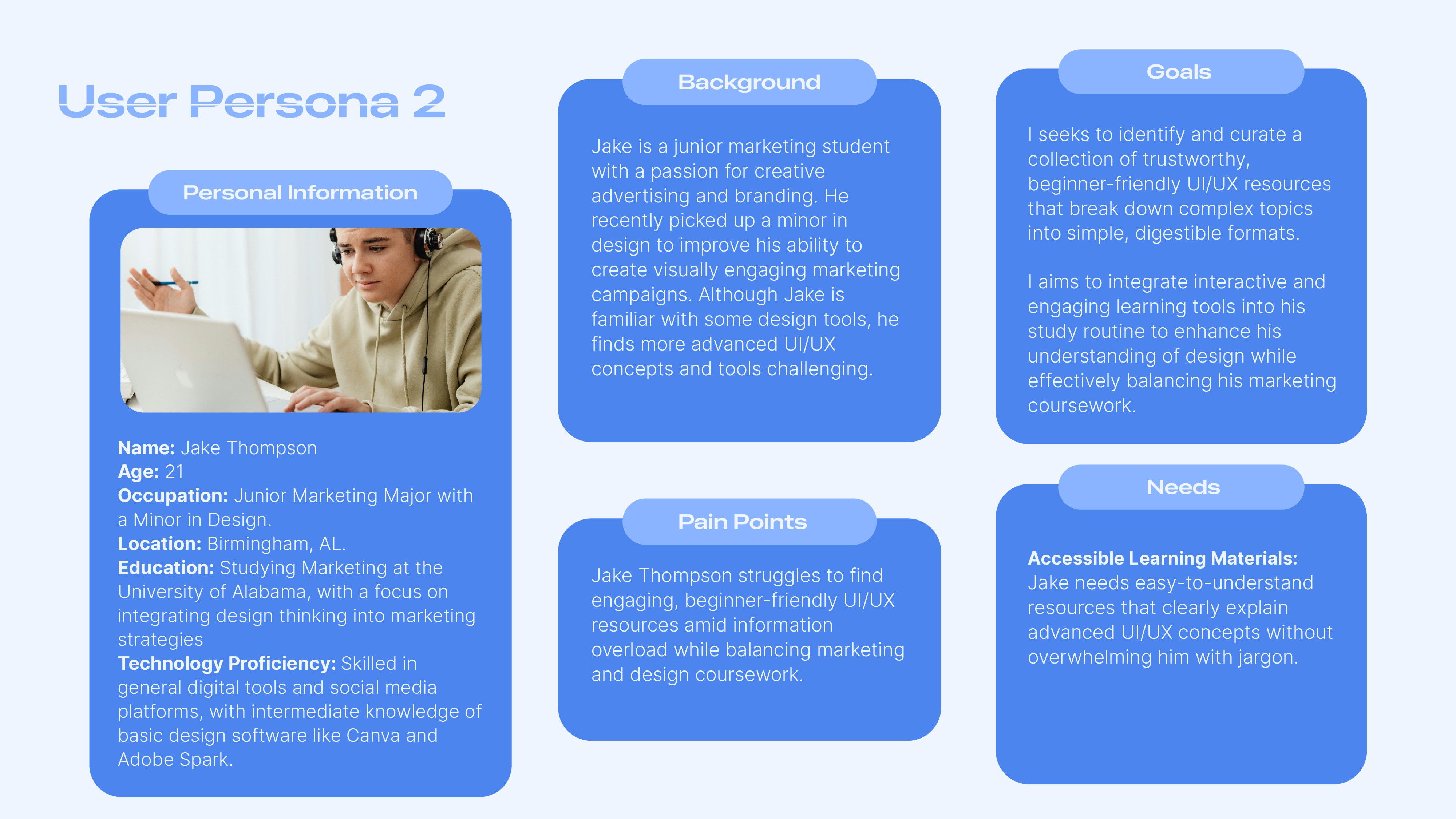
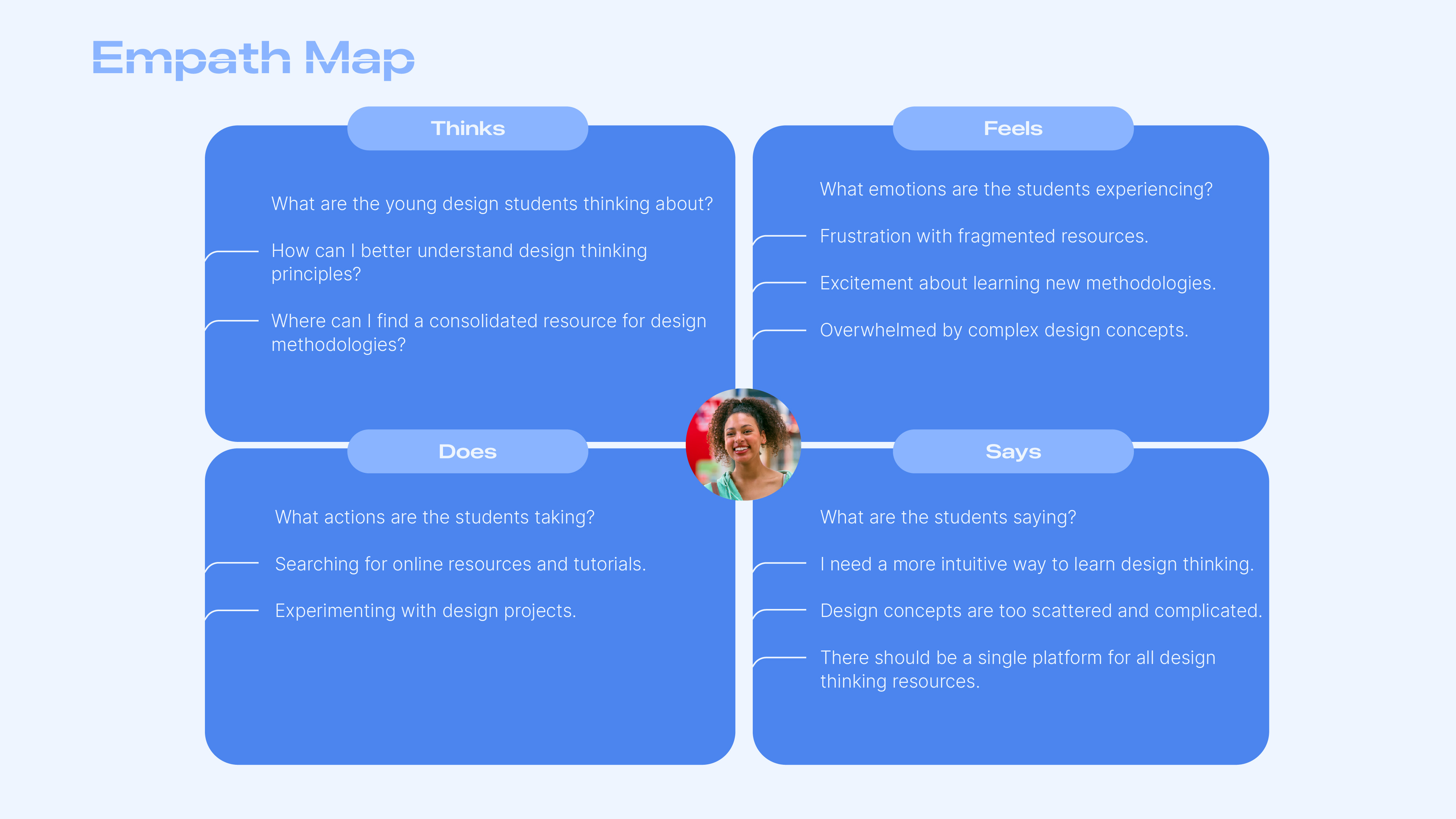
College freshmen and beginners in UI/UX design struggle to find accessible, engaging resources that simplify complex design concepts and processes, making it difficult to build foundational knowledge confidently.

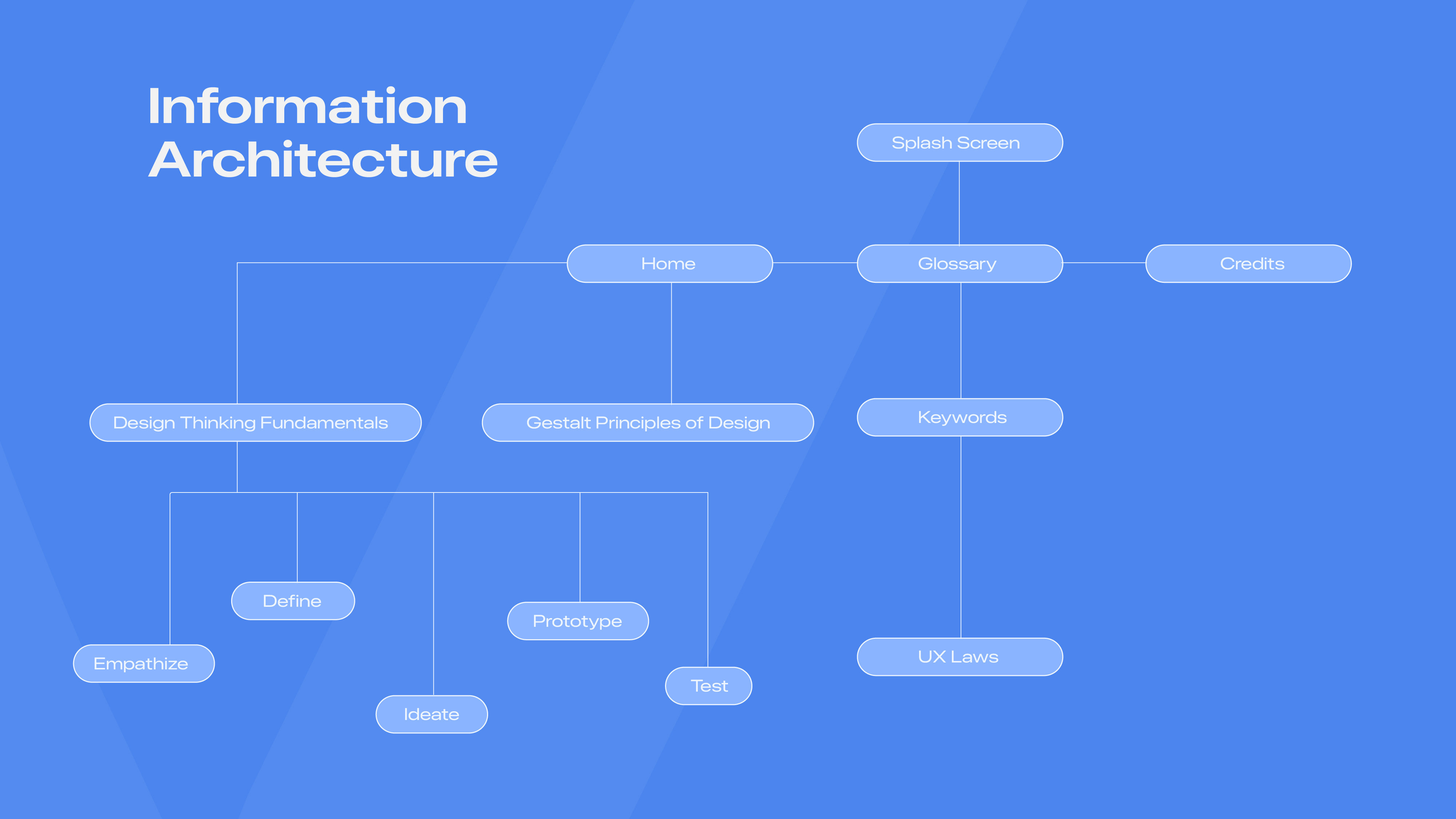
Concept Development
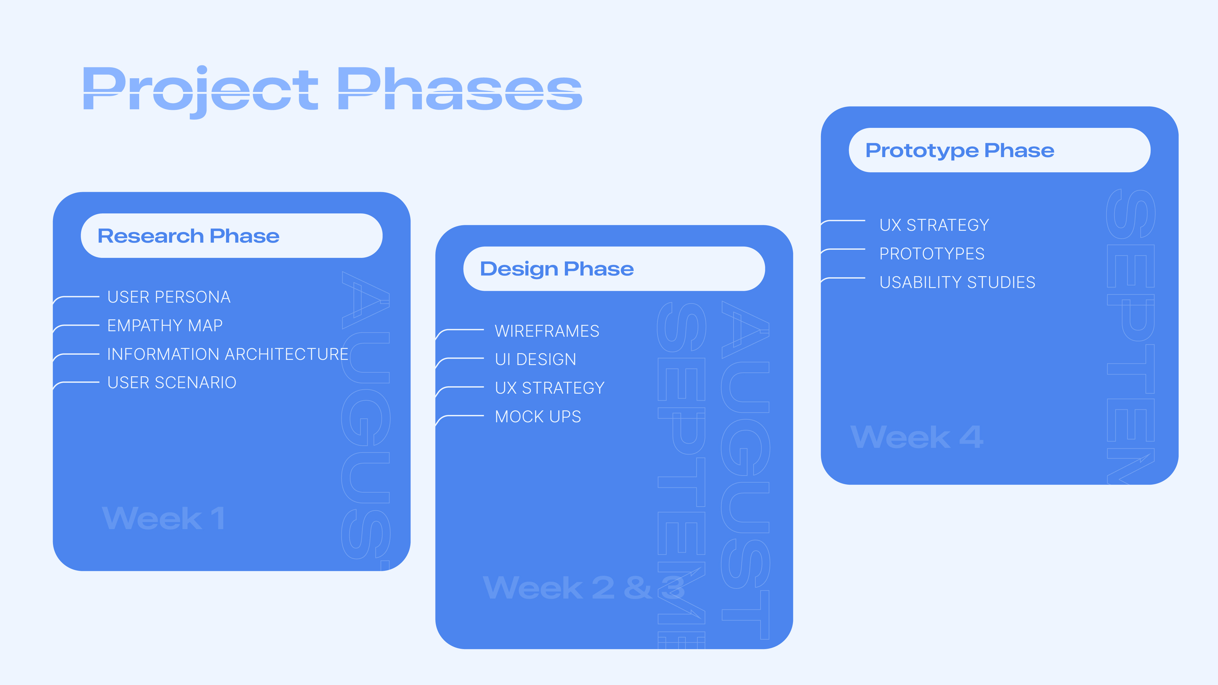
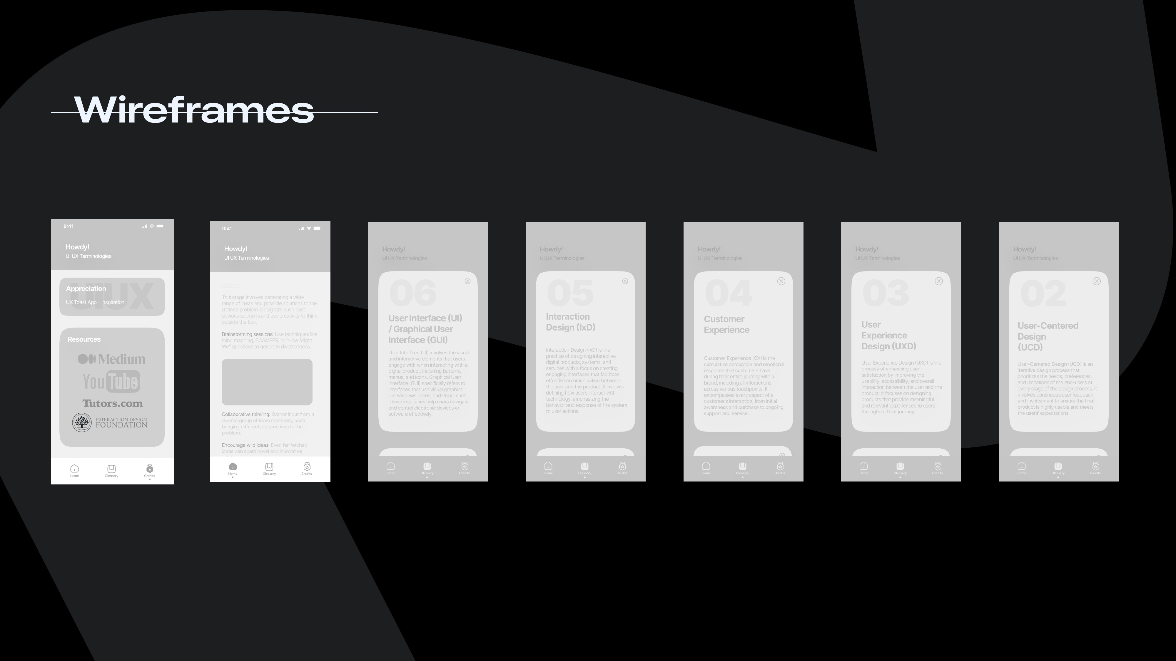
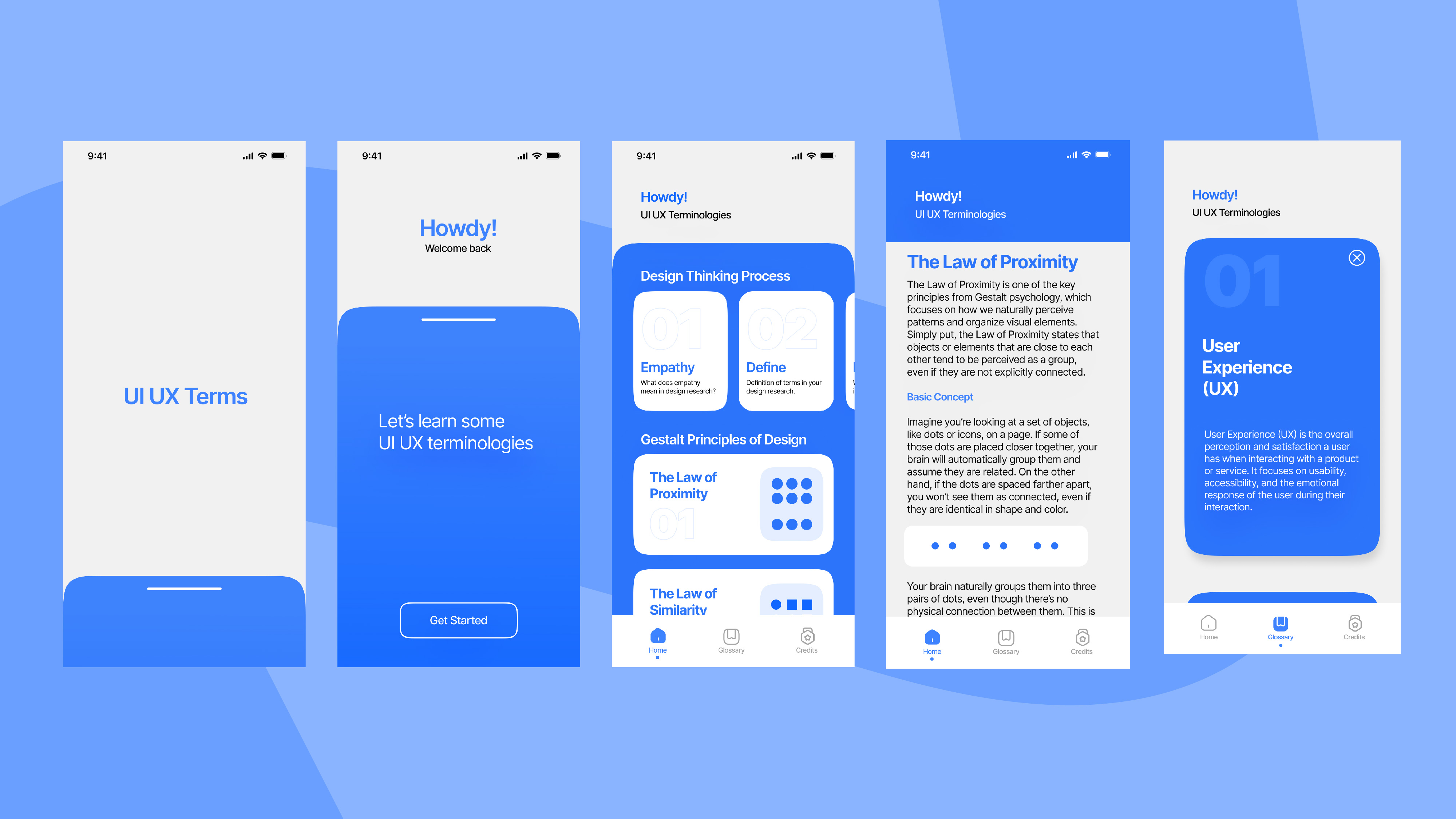
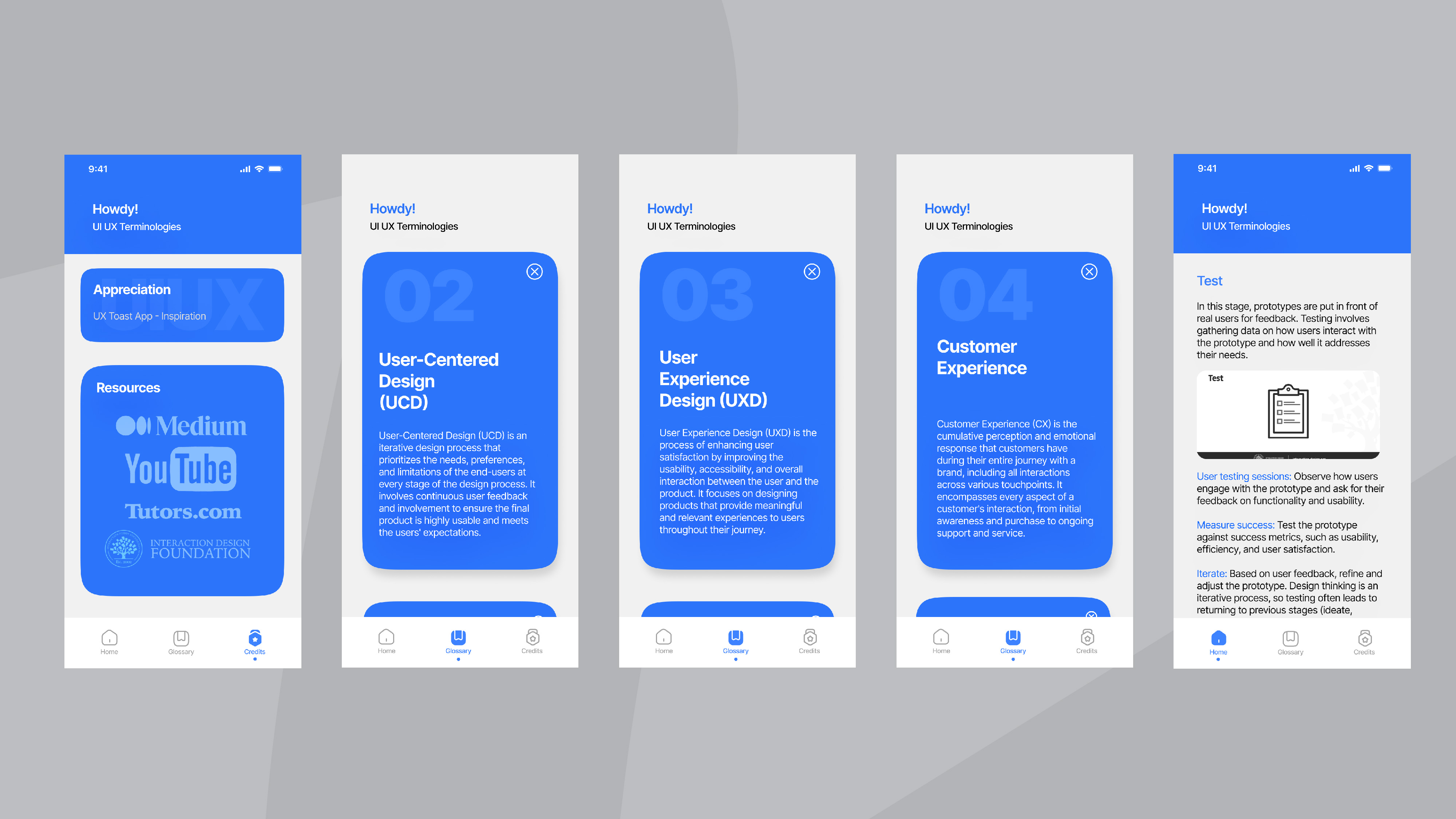
In the design phase, the initial wireframes were refined to create a seamless and intuitive user experience. Feedback from user testing informed adjustments to the layout and navigation, ensuring that the app was easy to use and visually appealing. The UI design focused on clean, engaging visuals with a balance of text and interactive elements, enhancing the learning process. Emphasis was placed on maintaining consistency across screens for a cohesive look and feel. The **UX strategy** centered on simplifying the user journey, optimizing the flow of information, and minimizing cognitive load, making the app accessible and enjoyable for beginners. This phase ensured that the app aligned with user expectations while staying true to its educational purpose.
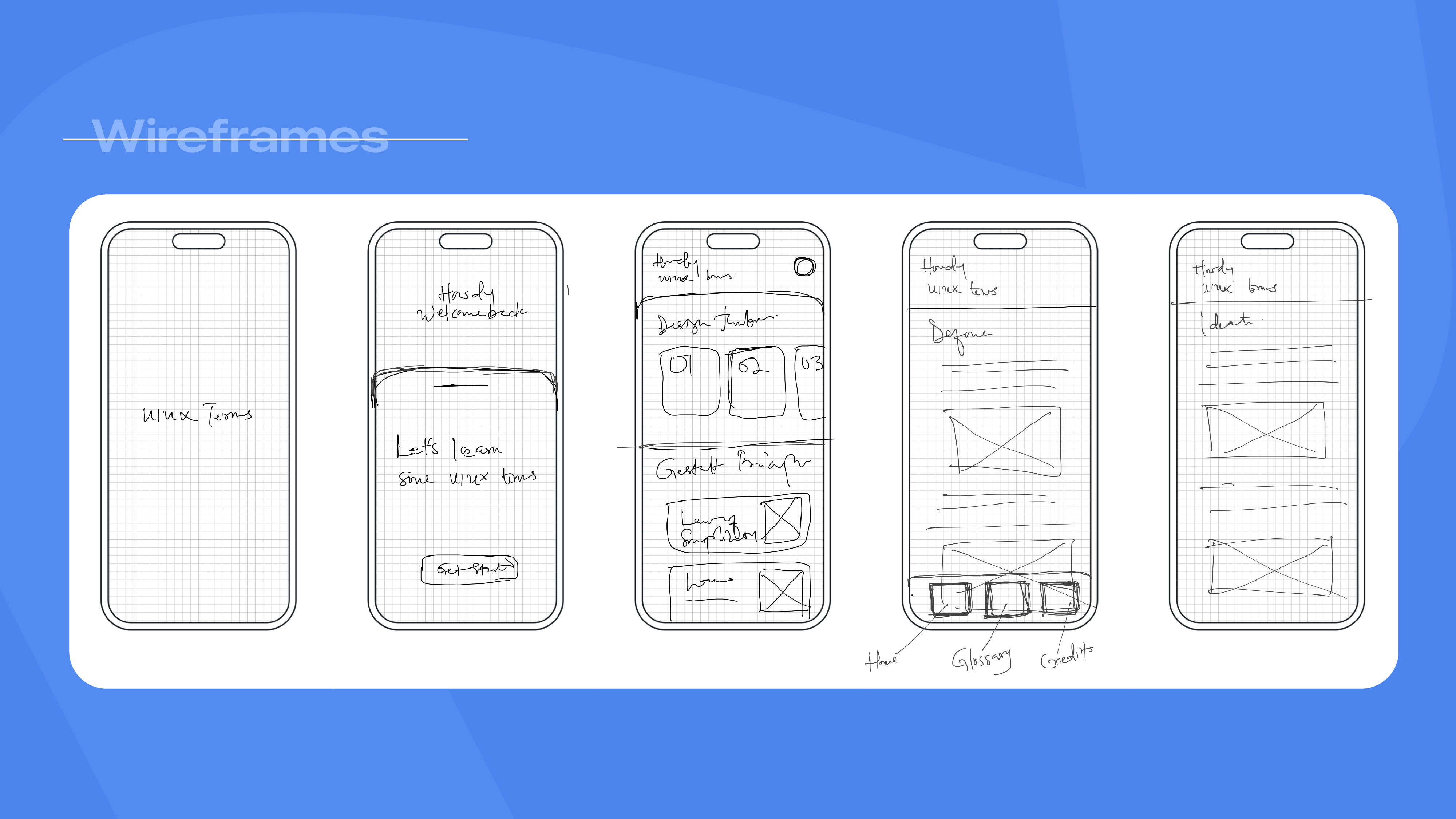
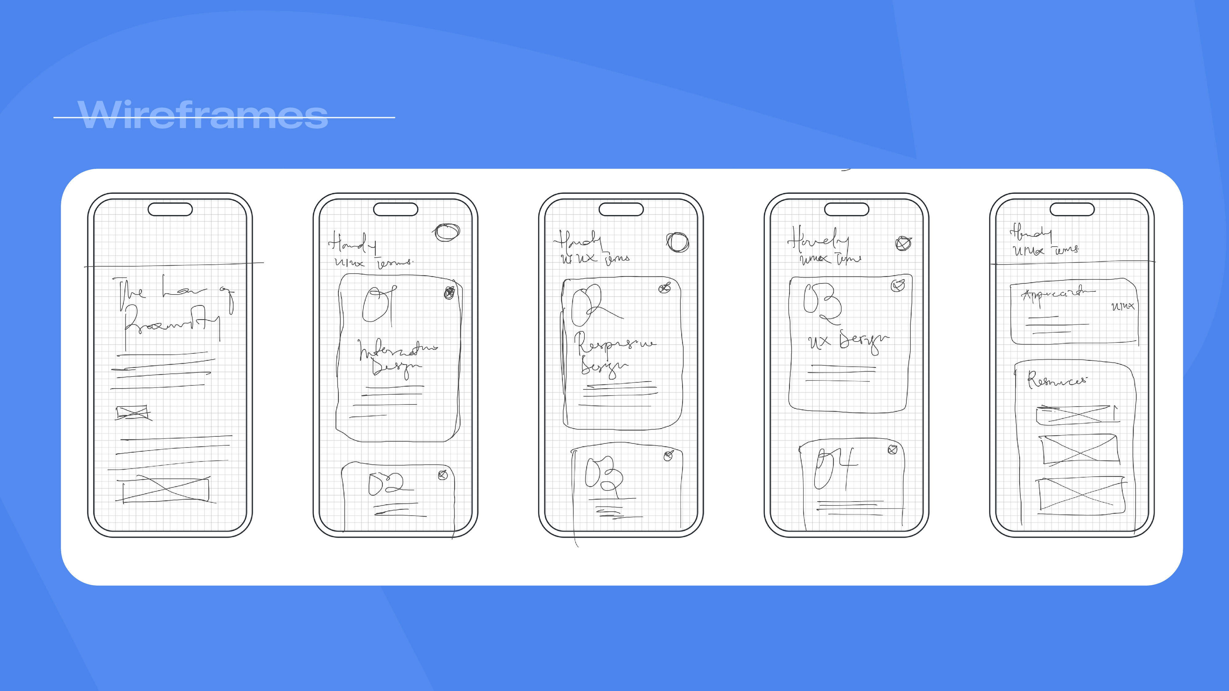
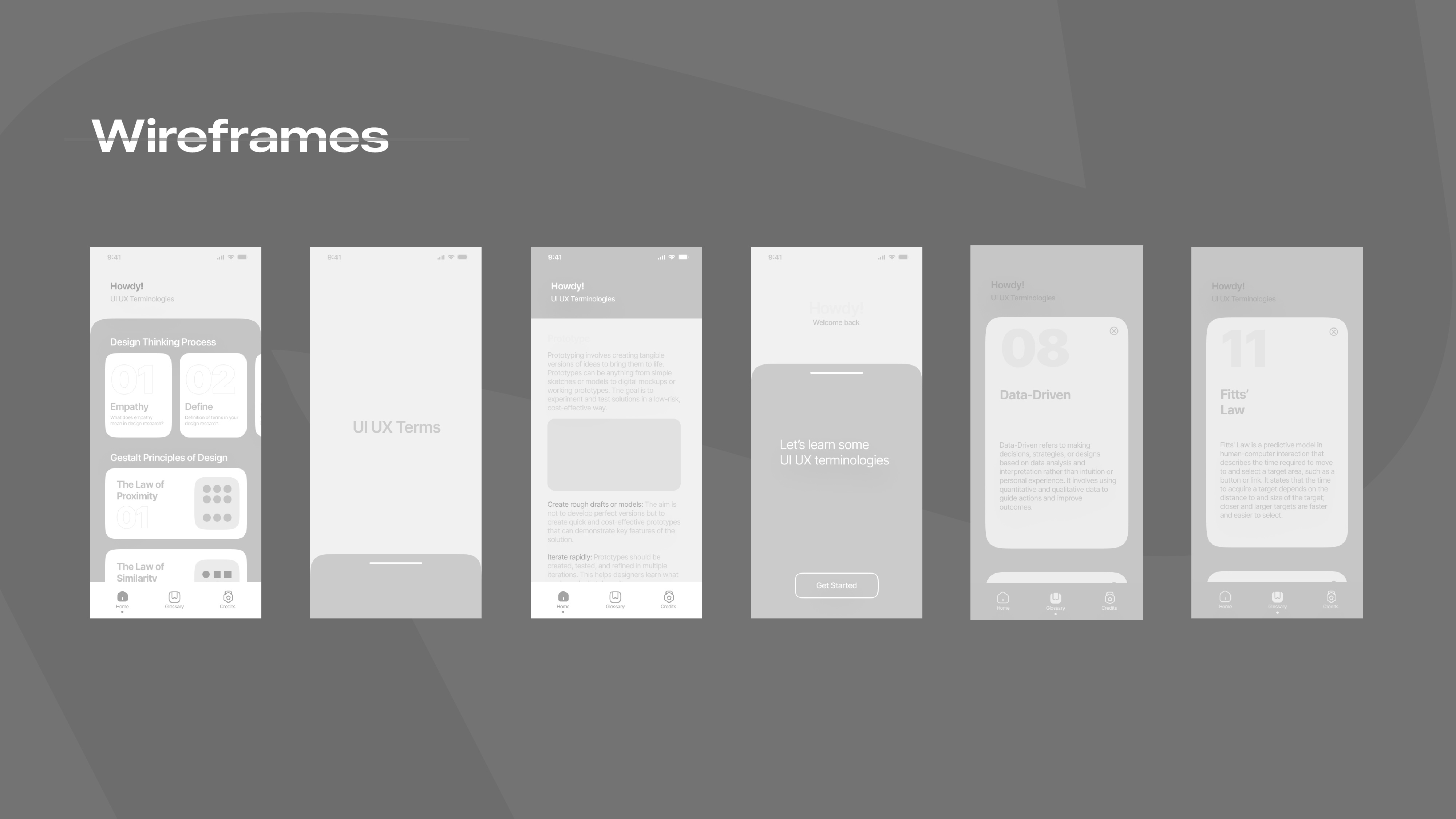
Iteration Process
In the prototype phase, interactive versions of the app were created to simulate the user experience and test key functionalities. These prototypes allowed for user feedback and iterative improvements, helping identify areas that needed refining before final development. The goal was to validate the user journey, assess the ease of navigation, and ensure that the content was engaging and accessible. This phase was crucial in confirming that the app met the needs of its target audience, leading to a polished and user-friendly final product.
