
Johnnie
Walker
Walker
Introduction
In celebration of Johnny Walker's 200-year milestone, the brand sought to commemorate this momentous occasion by showcasing their journey and engaging patrons in a dynamic and immersive way. I was part of the team tasked with designing and executing interactive media solutions for the main installation: the Flavor Academy. These experiences were crafted to highlight the brand's rich history while offering engaging, educational content to visitors.
-
YearDec 2020
-
ToolsFigma, Adobe XD, Illustrator
-
RoleUI Designer, Interaction Designer
Project Statement
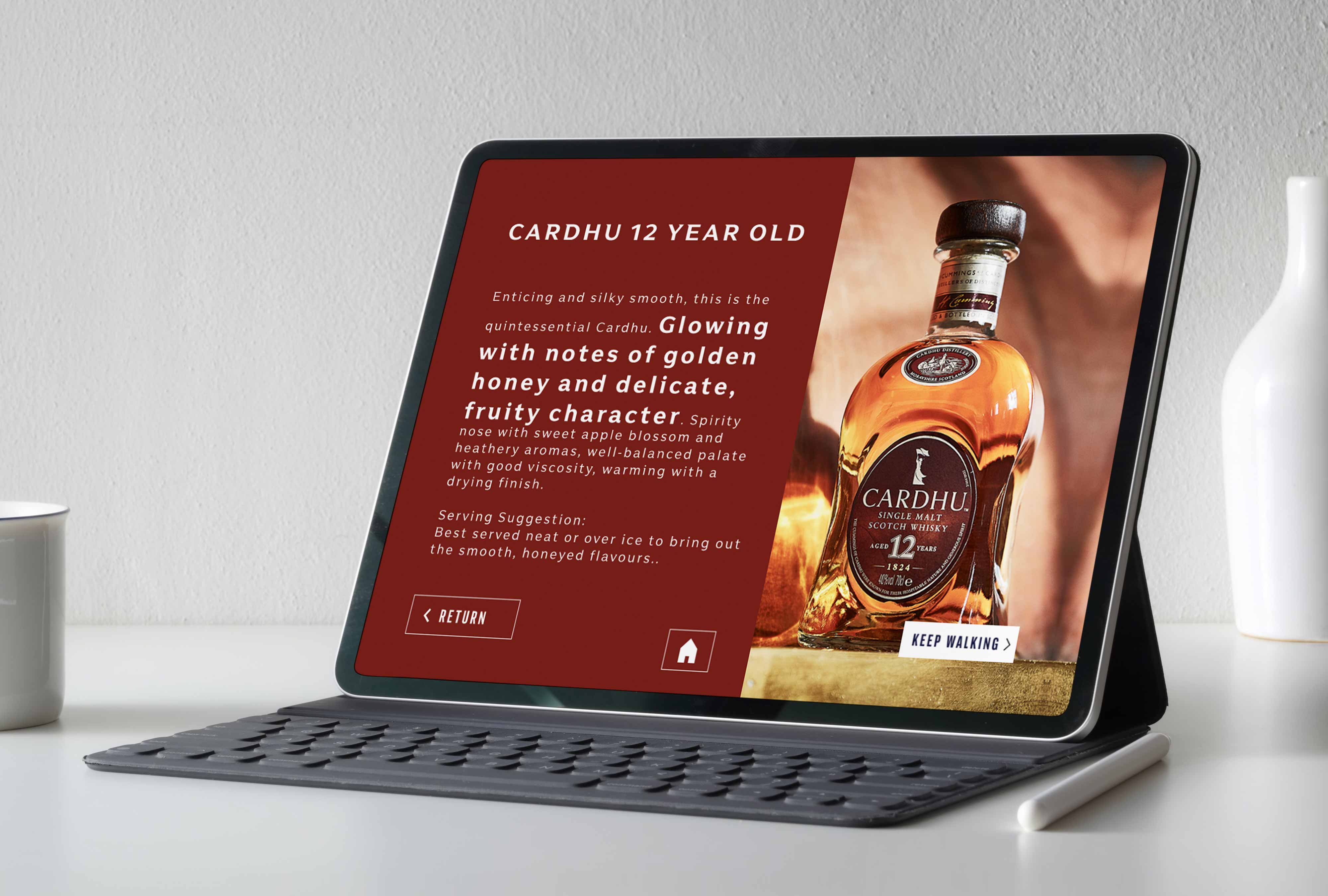
The Flavor Academy was designed to immerse guests in the whiskey blending process, providing a detailed and interactive educational experience. Central to this installation were four 6th generation iPads, which hosted a custom-designed interactive walkthrough. These iPads allowed guests to explore various whiskey flavors, blends, and general information about Johnny Walker in a personalized, museum-like setting. Each iPad offered intuitive, touch-based navigation, enabling guests to delve deeper into the brand’s craftsmanship and heritage at their own pace, creating an engaging and informative experience.
The overarching goal of this project was to create an engaging and interactive experience that celebrated Johnny Walker's heritage while educating and entertaining guests. The installations were designed to enhance user interaction, leveraging touch technology and real-time feedback mechanisms to provide a seamless user experience.
Design Process
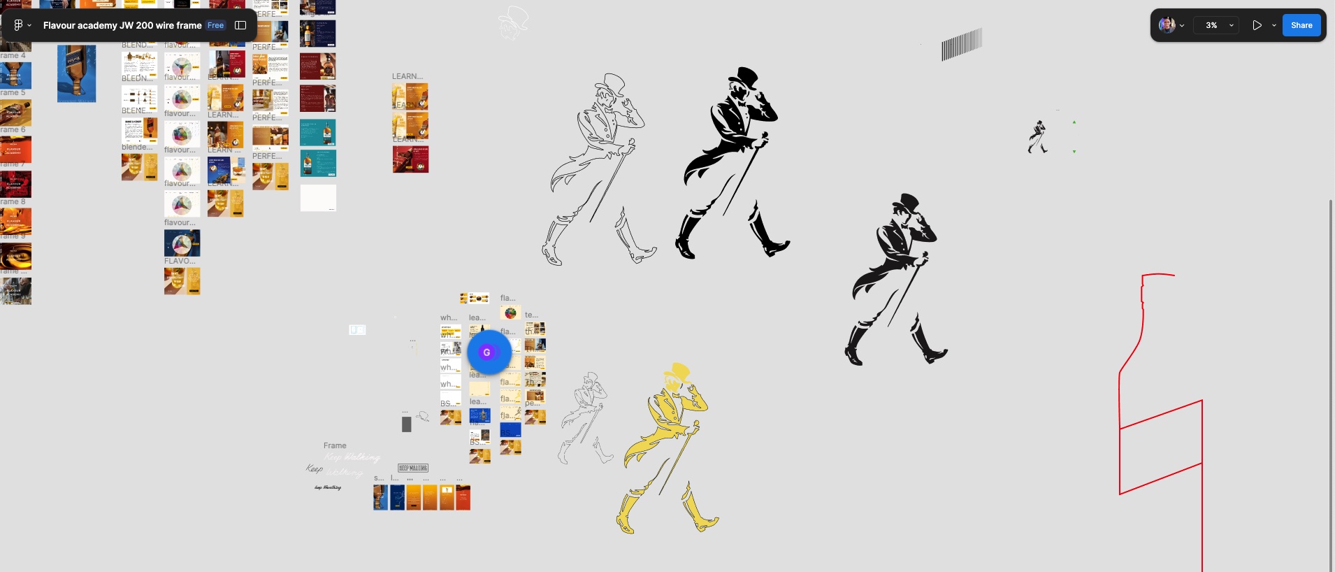
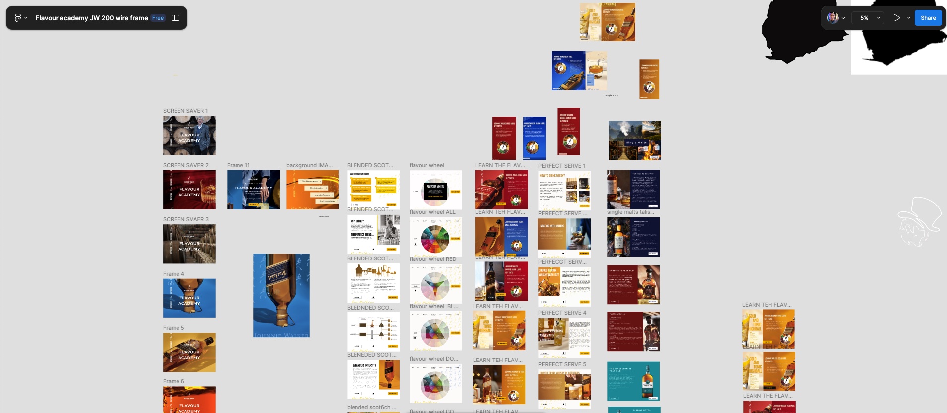
This project was a dynamic collaboration with the Johnny Walker Global team, where maintaining brand integrity was key. Using Figma as the central tool, I crafted the UI designs while seamlessly integrating feedback from both supervisors and the global design team. The shared Figma canvas enabled real-time collaboration, allowing for quick iterations and efficient design refinement.
A standout lesson from working with the global team was their uncompromising attention to detail—every image, color choice, and button placement was intentional. I also deepened my understanding of typography hierarchy, learning how to distinguish between typefaces for interactive versus print media.
The design decision that truly elevated this project was my focus on visualizing user interactions. By considering how users would engage with each element—factoring in the mood, environment, and overall user experience—I ensured that every interaction was fluid and intuitive. This emphasis on creating a visually cohesive experience, driven by real-world context, became the hallmark of the project’s success.
Iteration toFinal Design
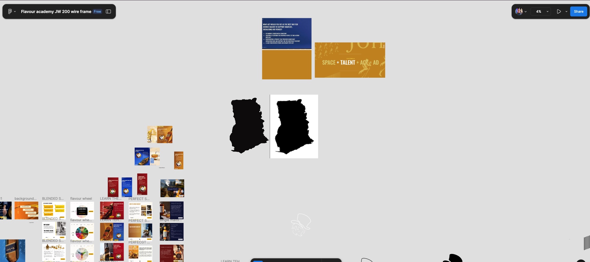
Following multiple iterations aimed at validating the content flow and ensuring the educational material was effectively understood by users, I transitioned to designing the visual assets—including wallpapers and other key branding elements. This phase was essential in enhancing the overall user experience, ensuring that the visual design not only complemented the educational journey but also adhered to the brand’s identity with precision and cohesion.




FinalDesigns
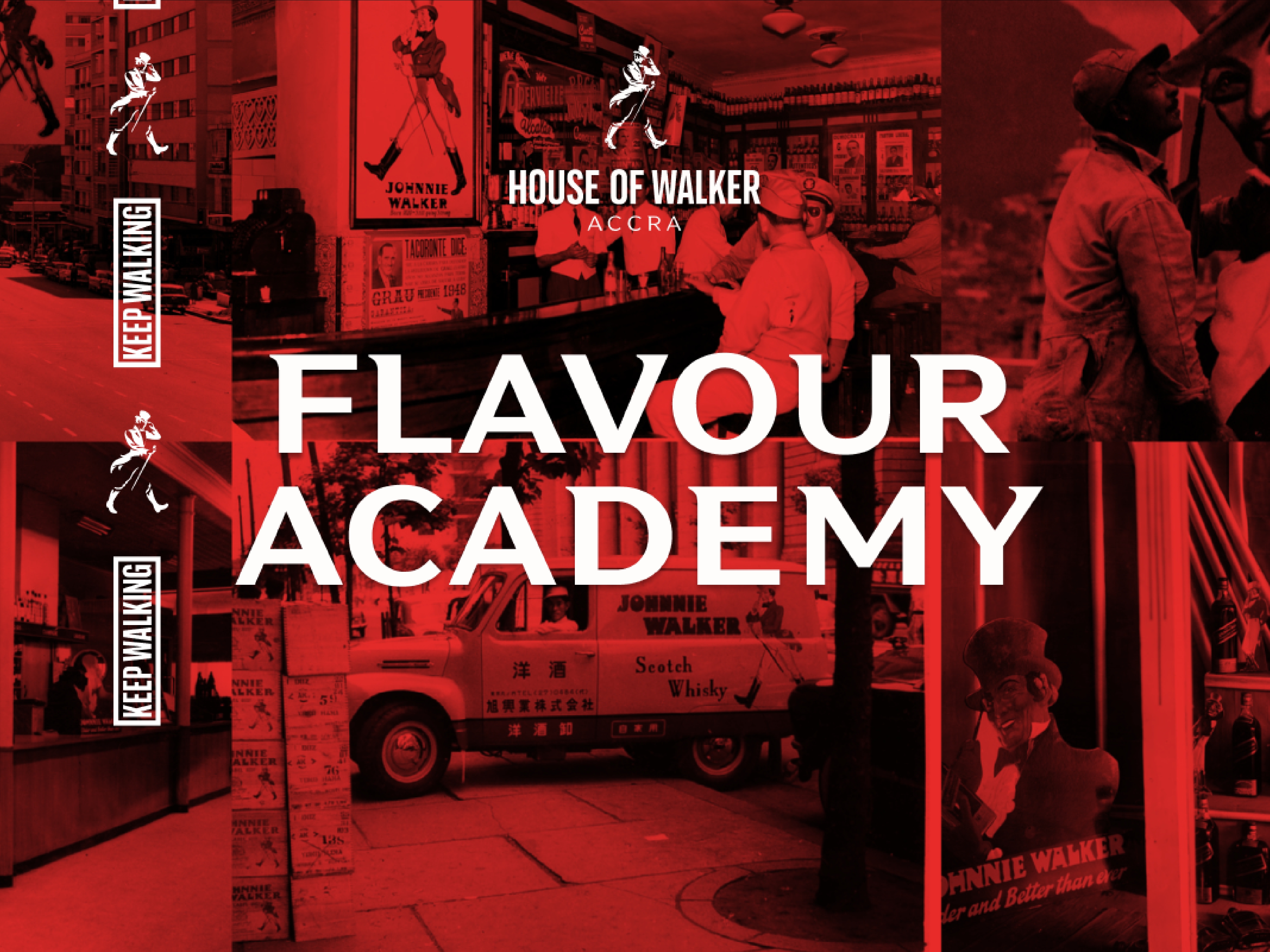
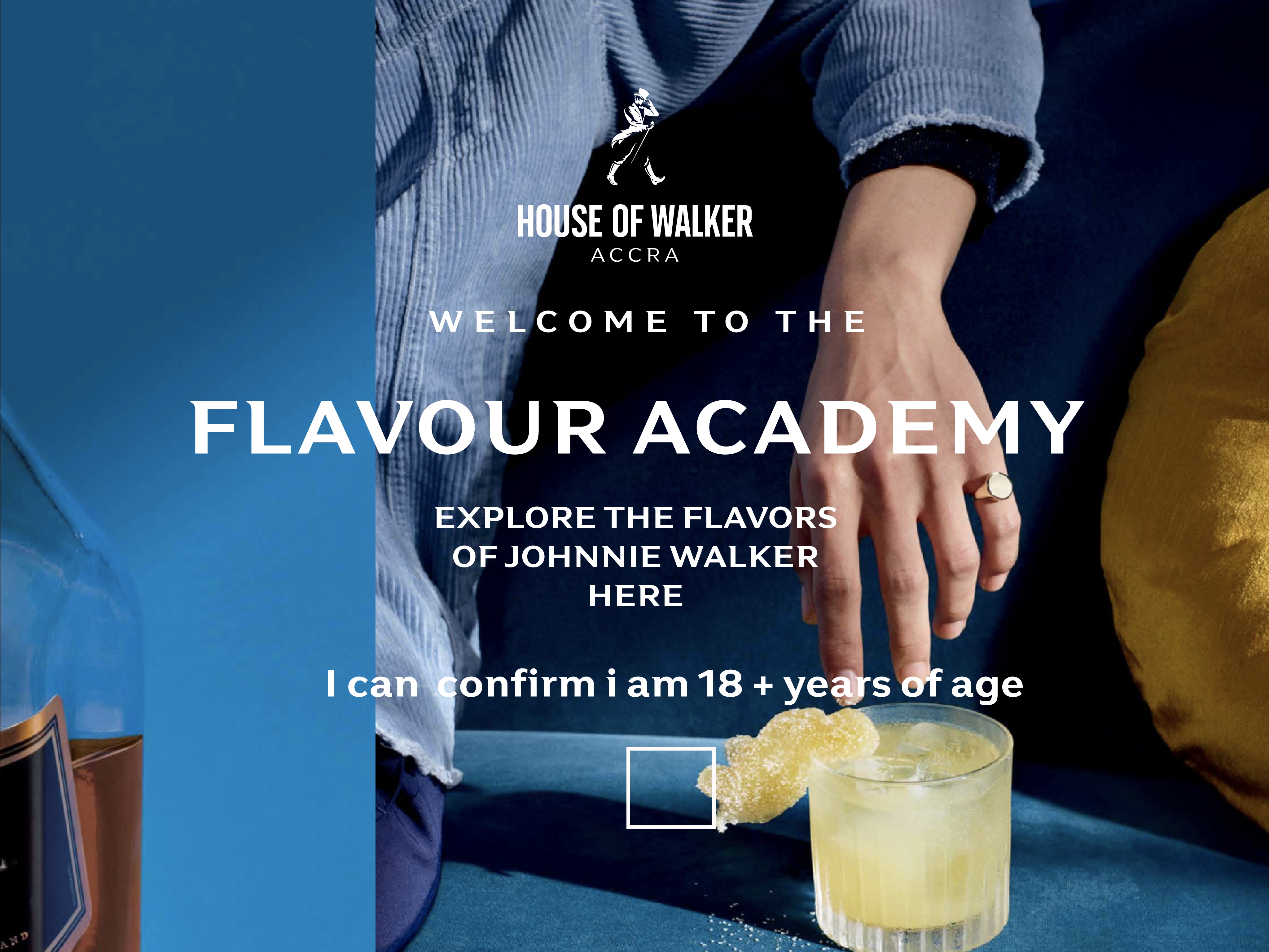
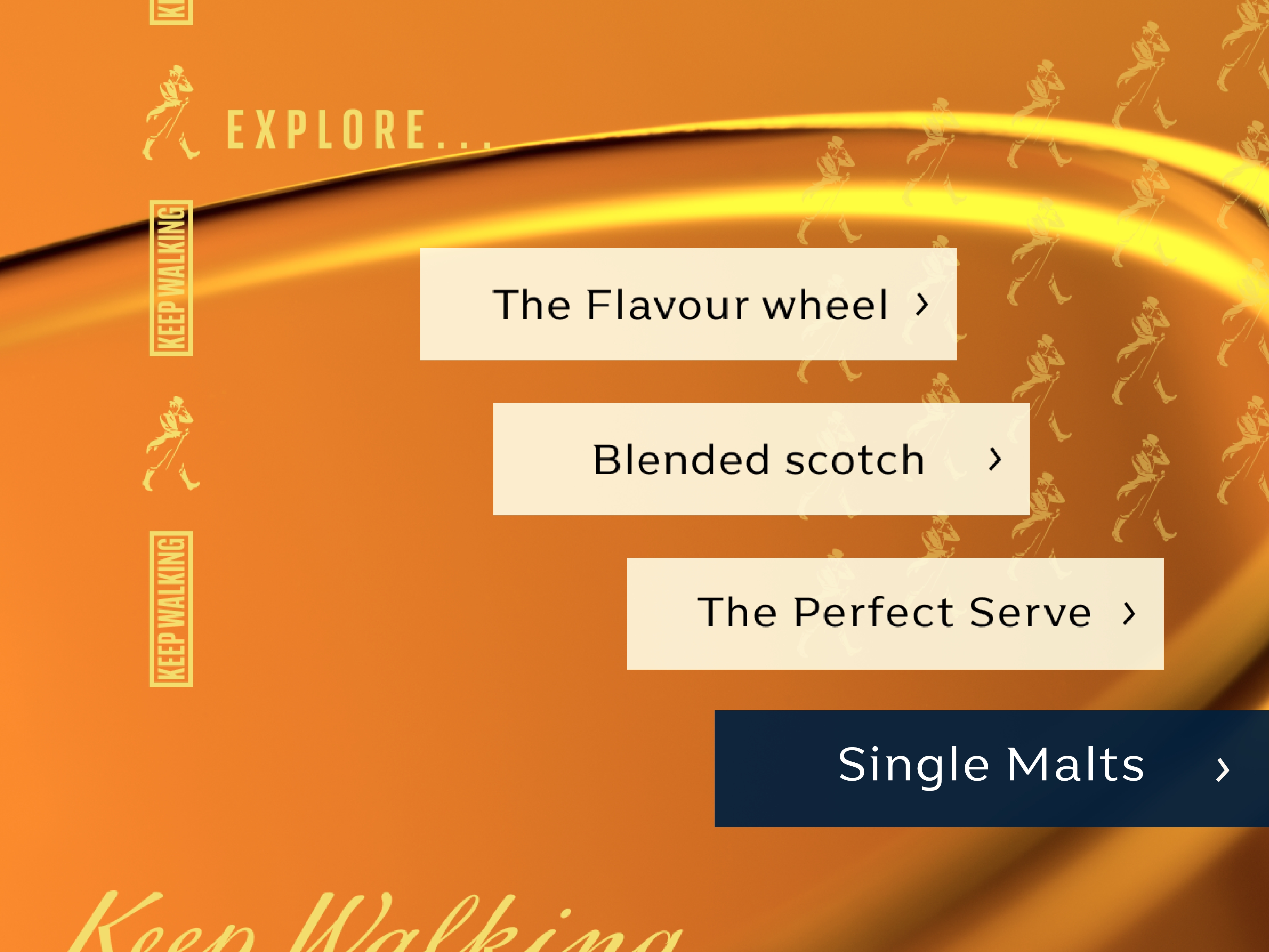
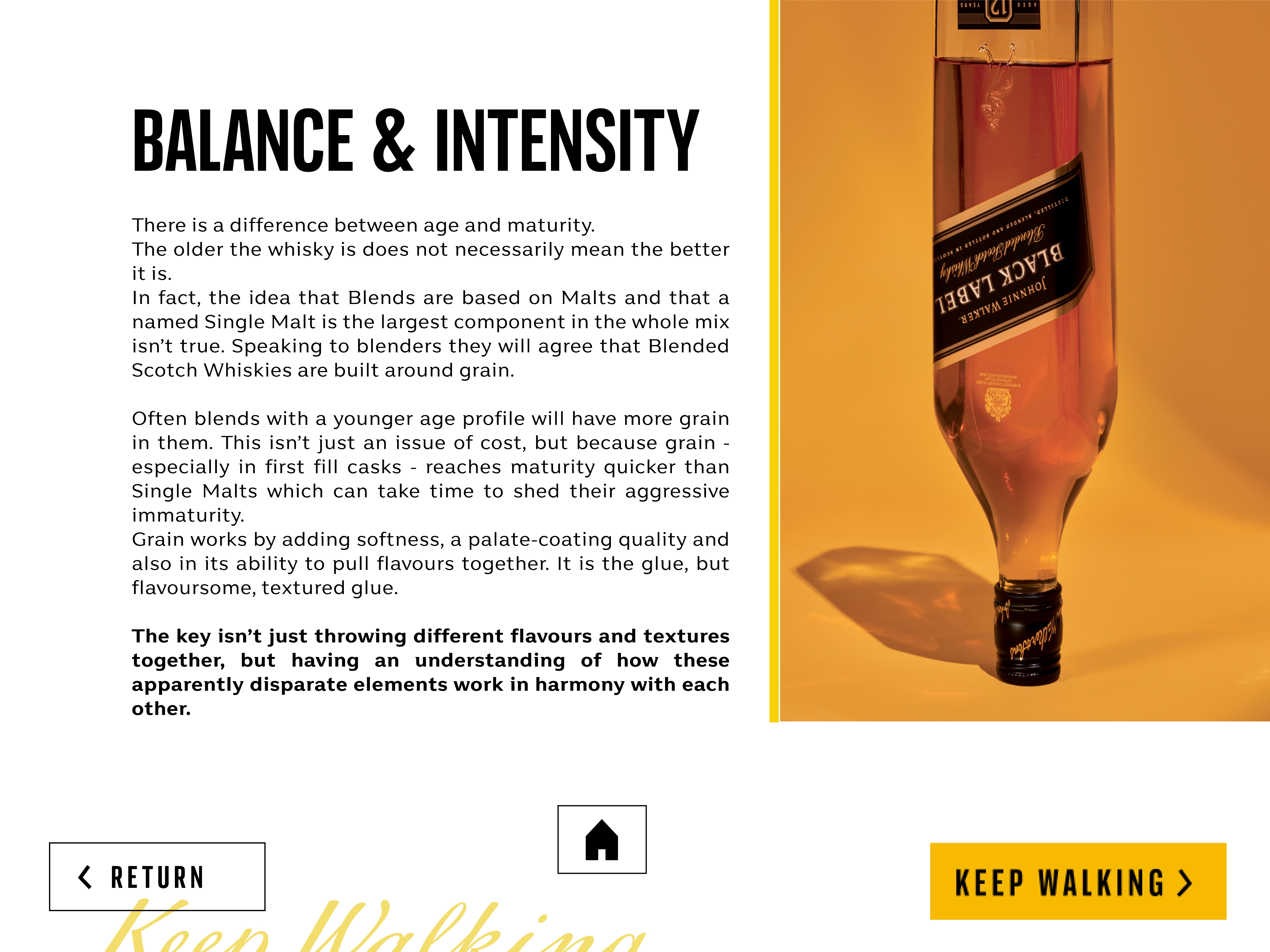
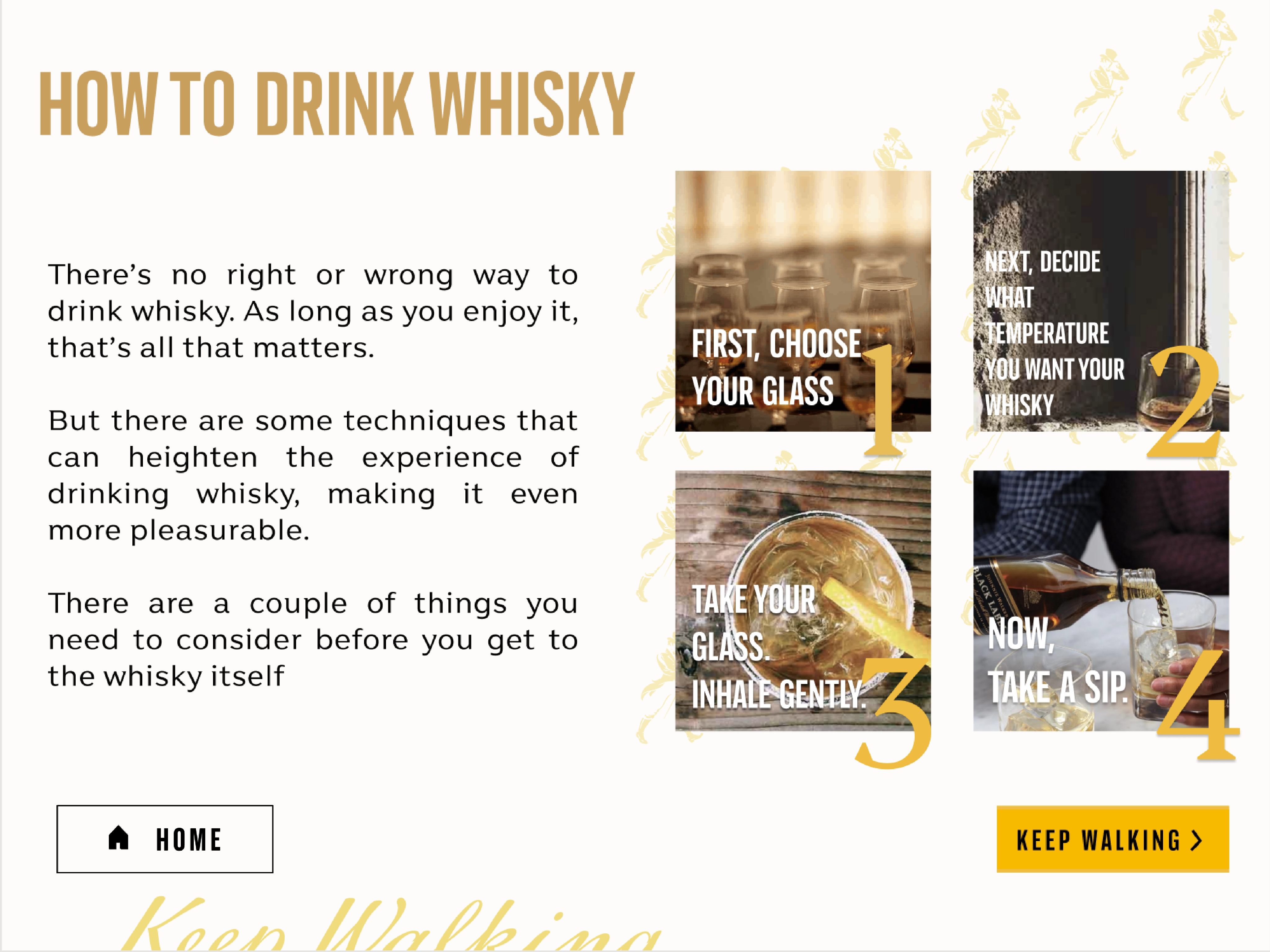
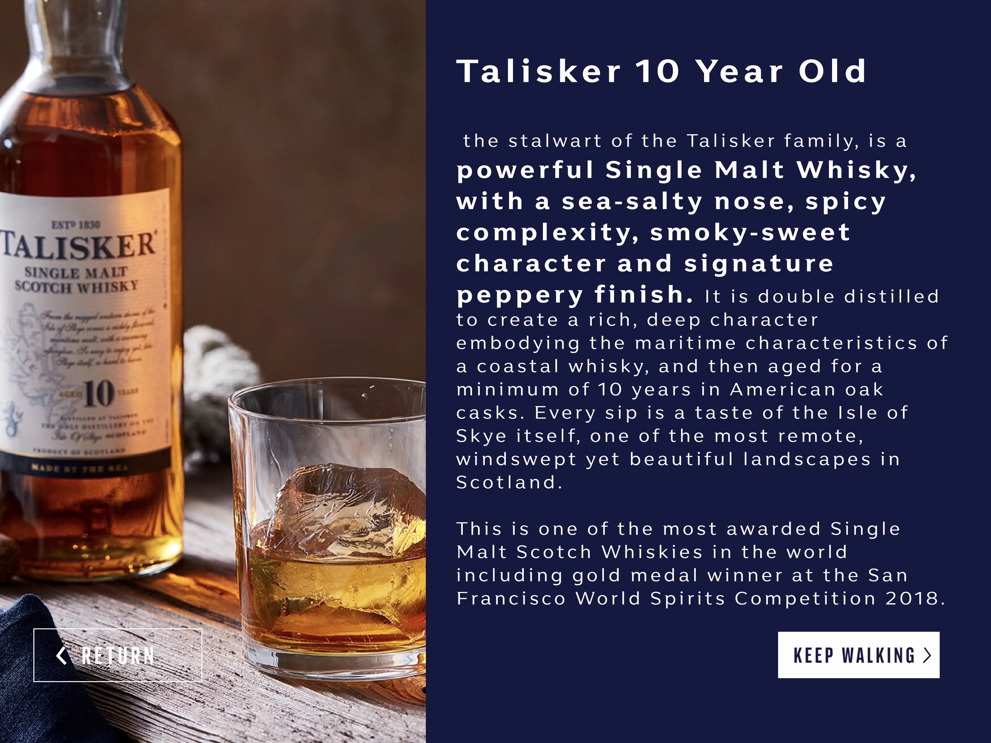
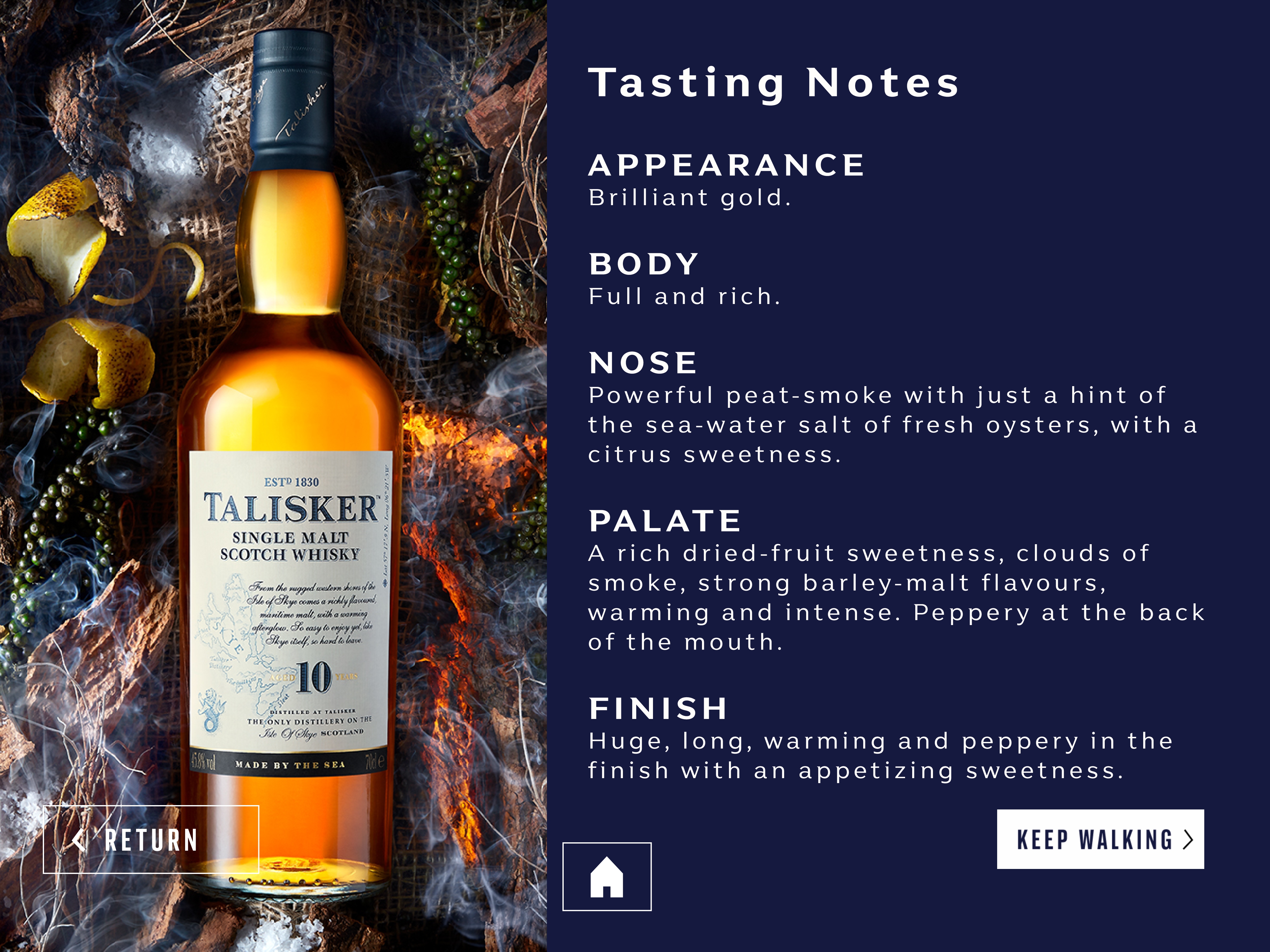
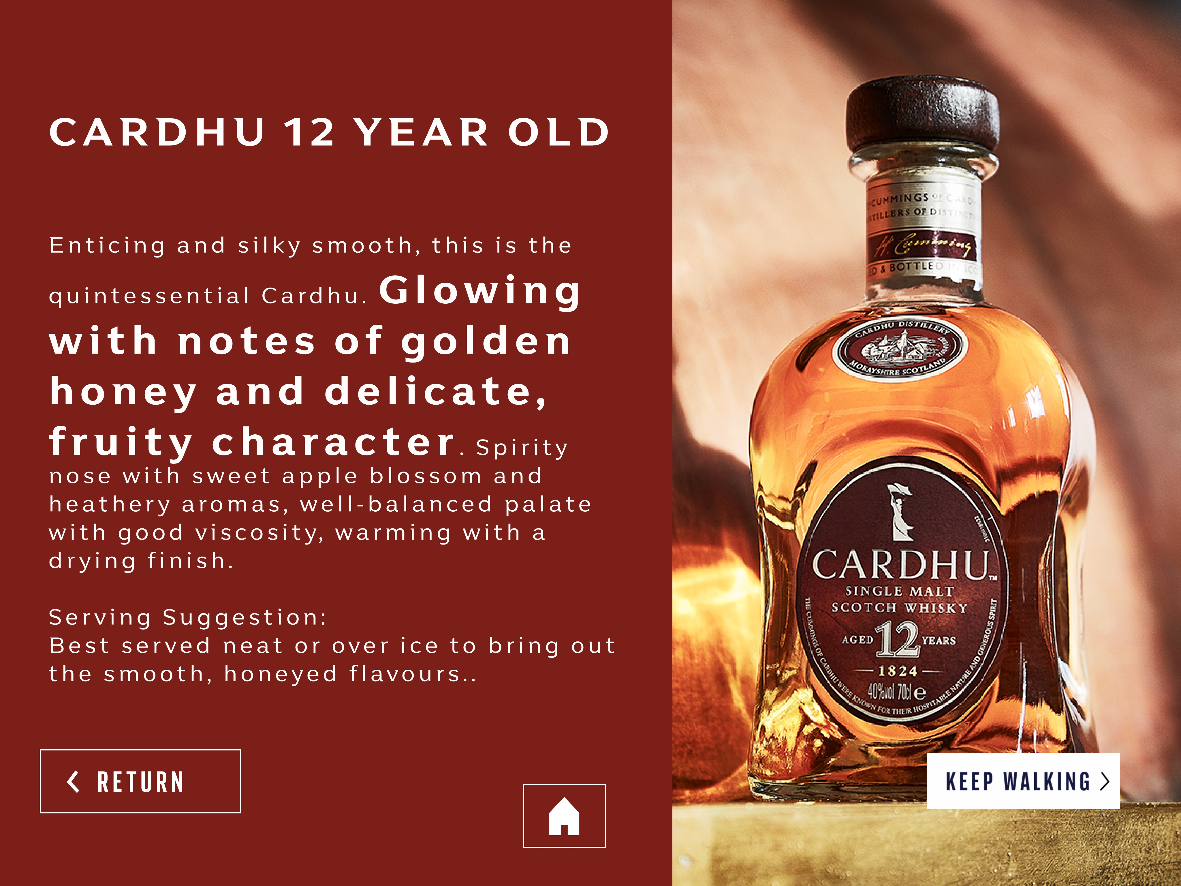
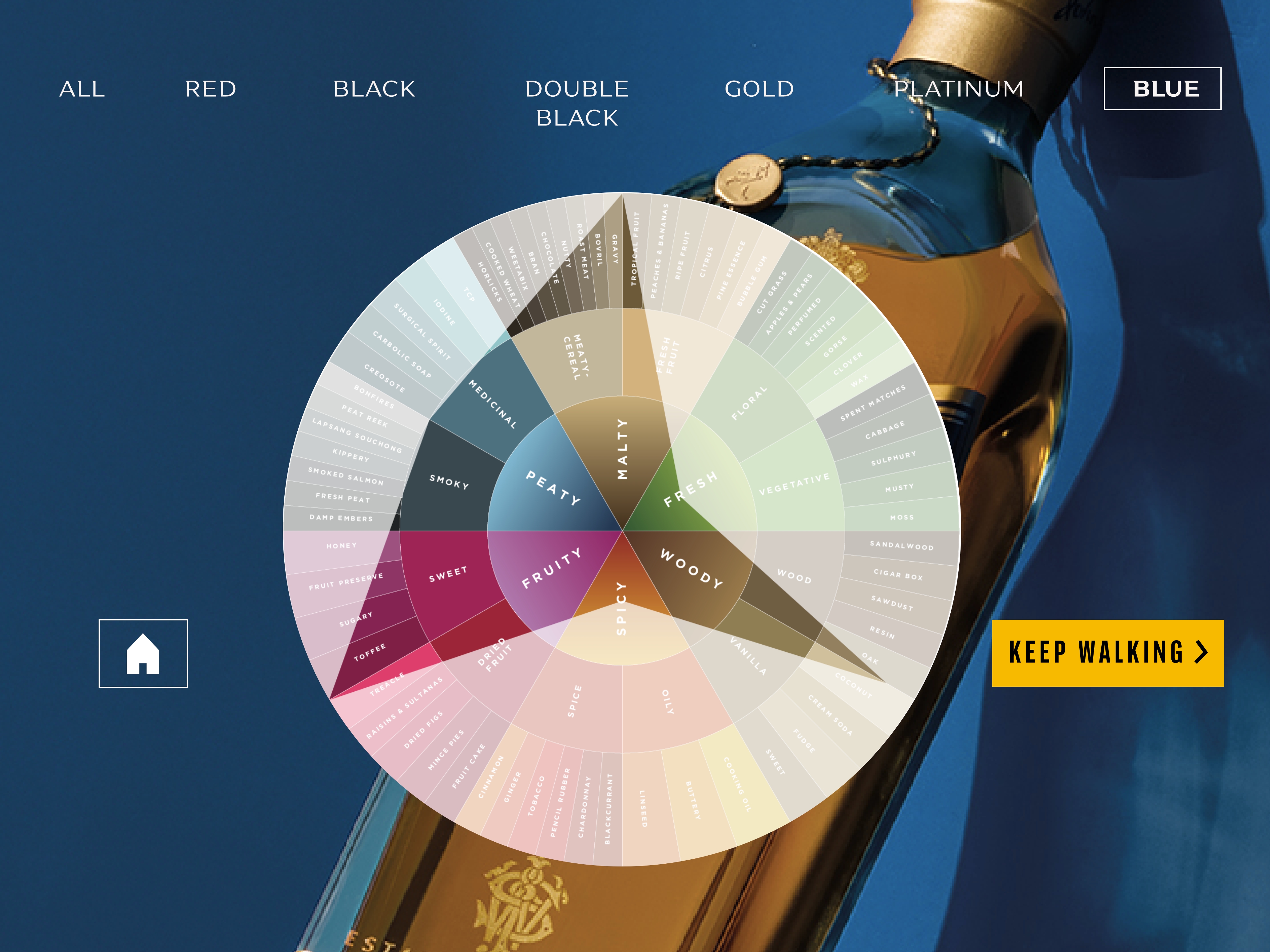
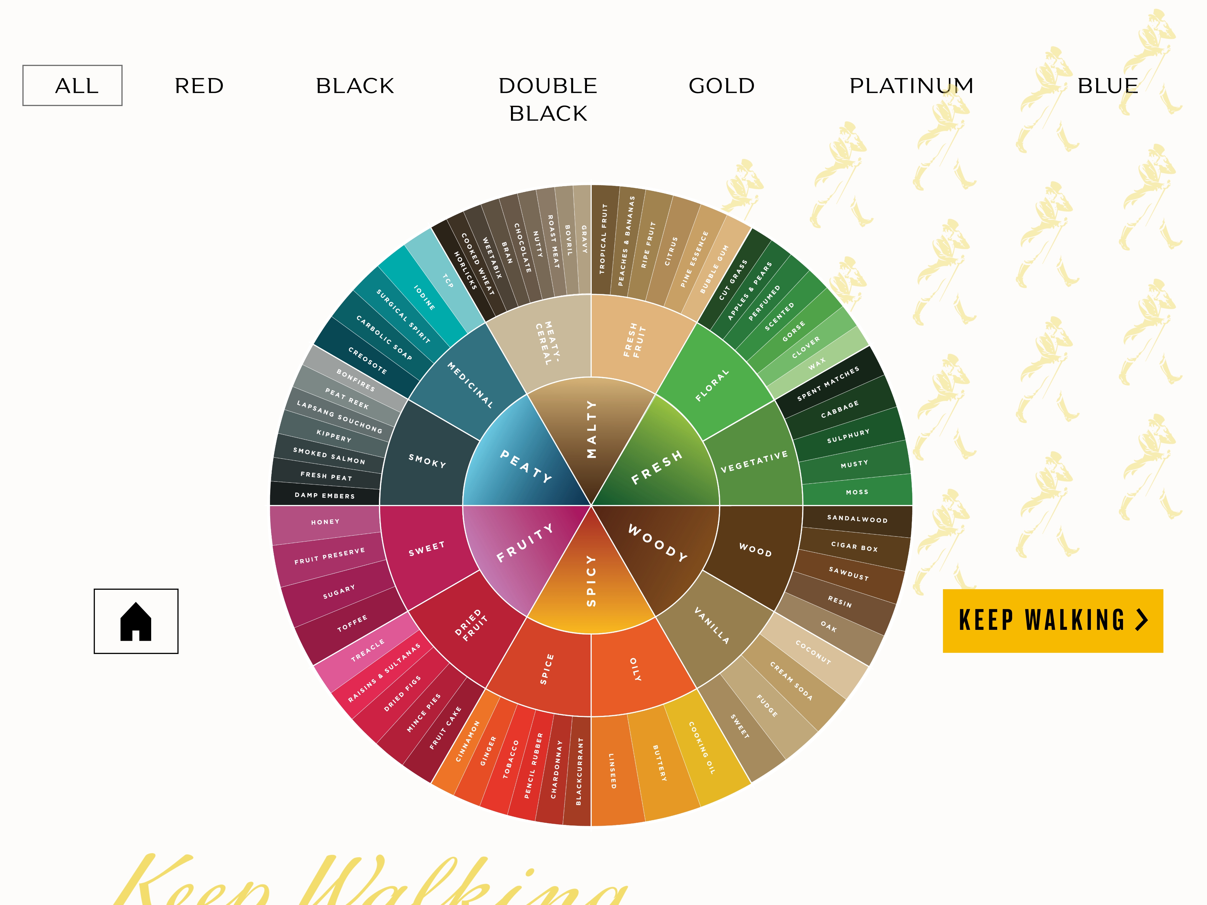
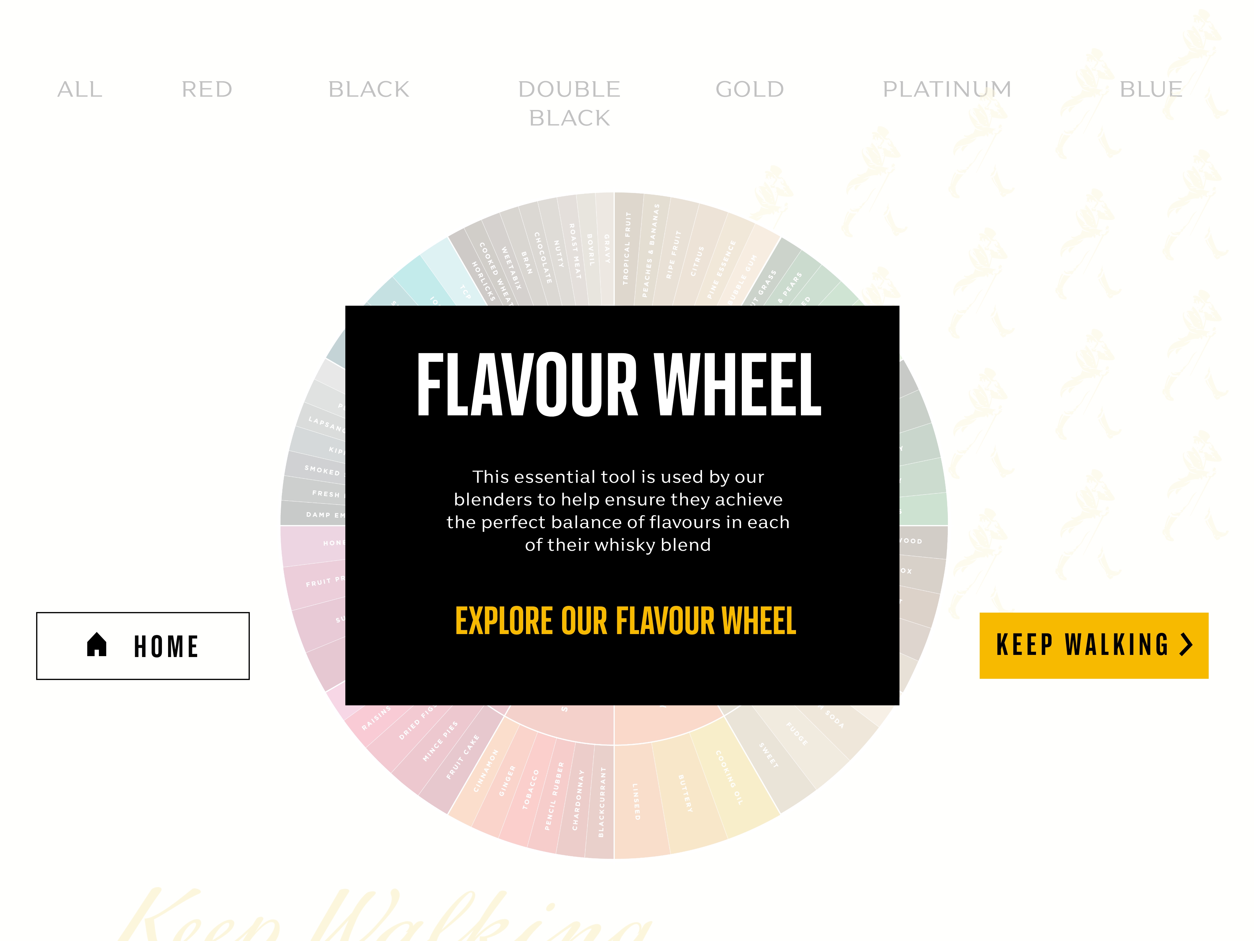
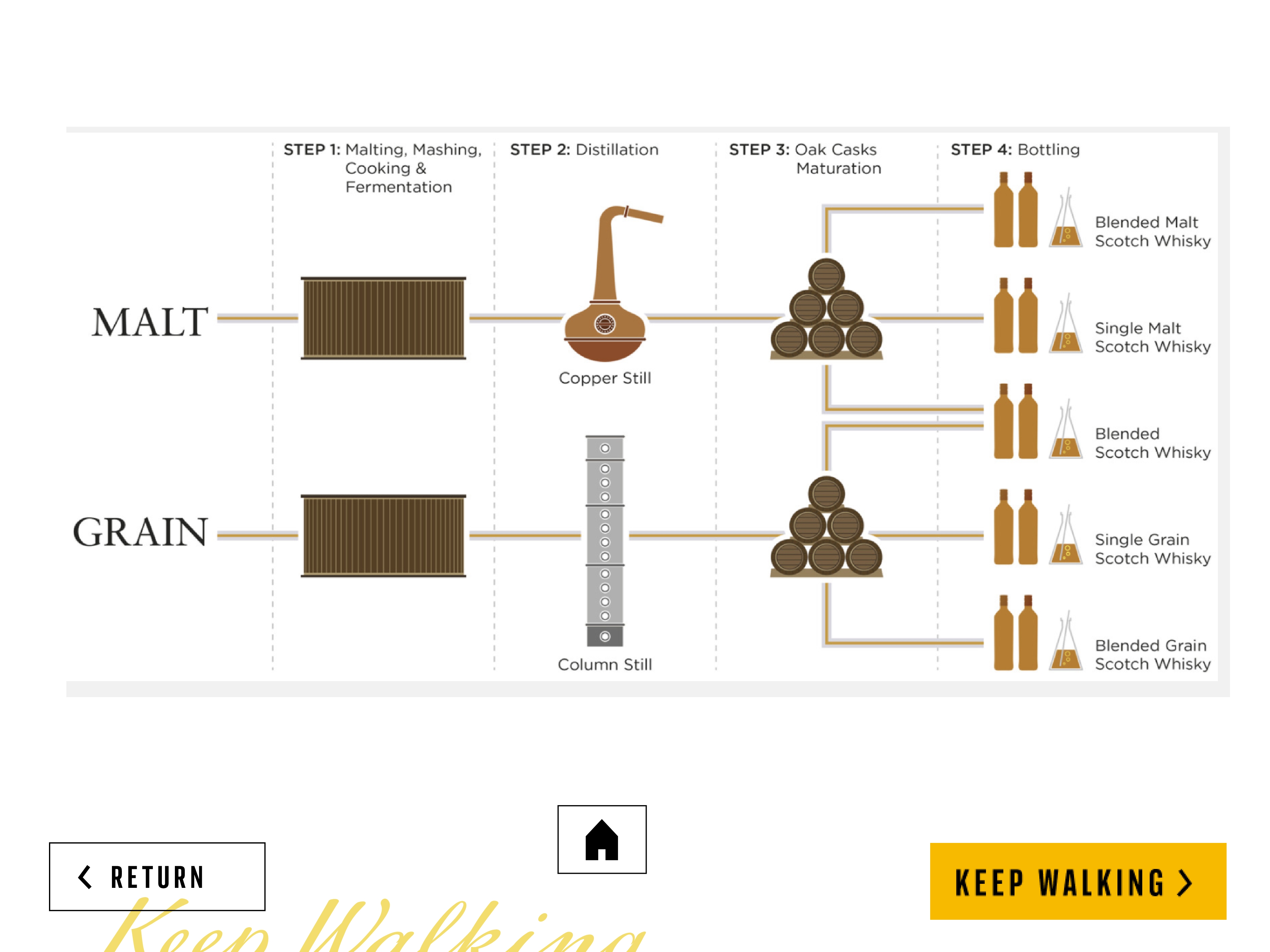
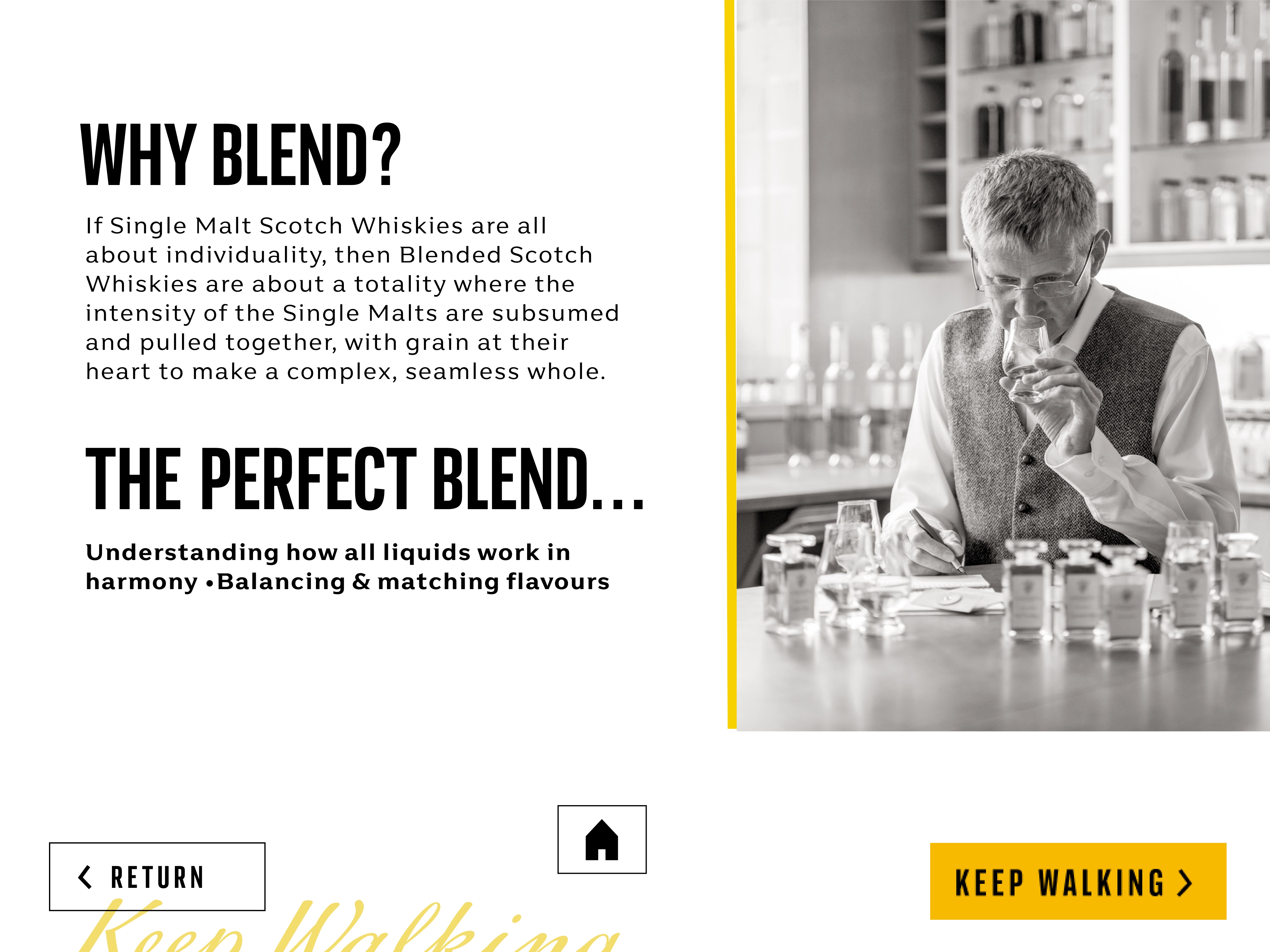
The final designs brought together a seamless blend of interactivity, educational content, and brand aesthetics. Each visual element was crafted with a focus on clarity and user engagement, ensuring that the educational journey felt intuitive and immersive. The wallpapers and supporting visuals were designed to complement the interactive experiences, maintaining a cohesive look that aligned with Johnny Walker’s iconic branding.
From the typography hierarchy to the button placements, every design choice was intentional, creating an elegant and functional interface. The visual flow smoothly guided users through the content while preserving the brand’s rich history and premium feel. The final result was a refined, interactive experience that successfully merged storytelling with user-friendly design, enhancing the brand’s connection with its audience.
Prototype
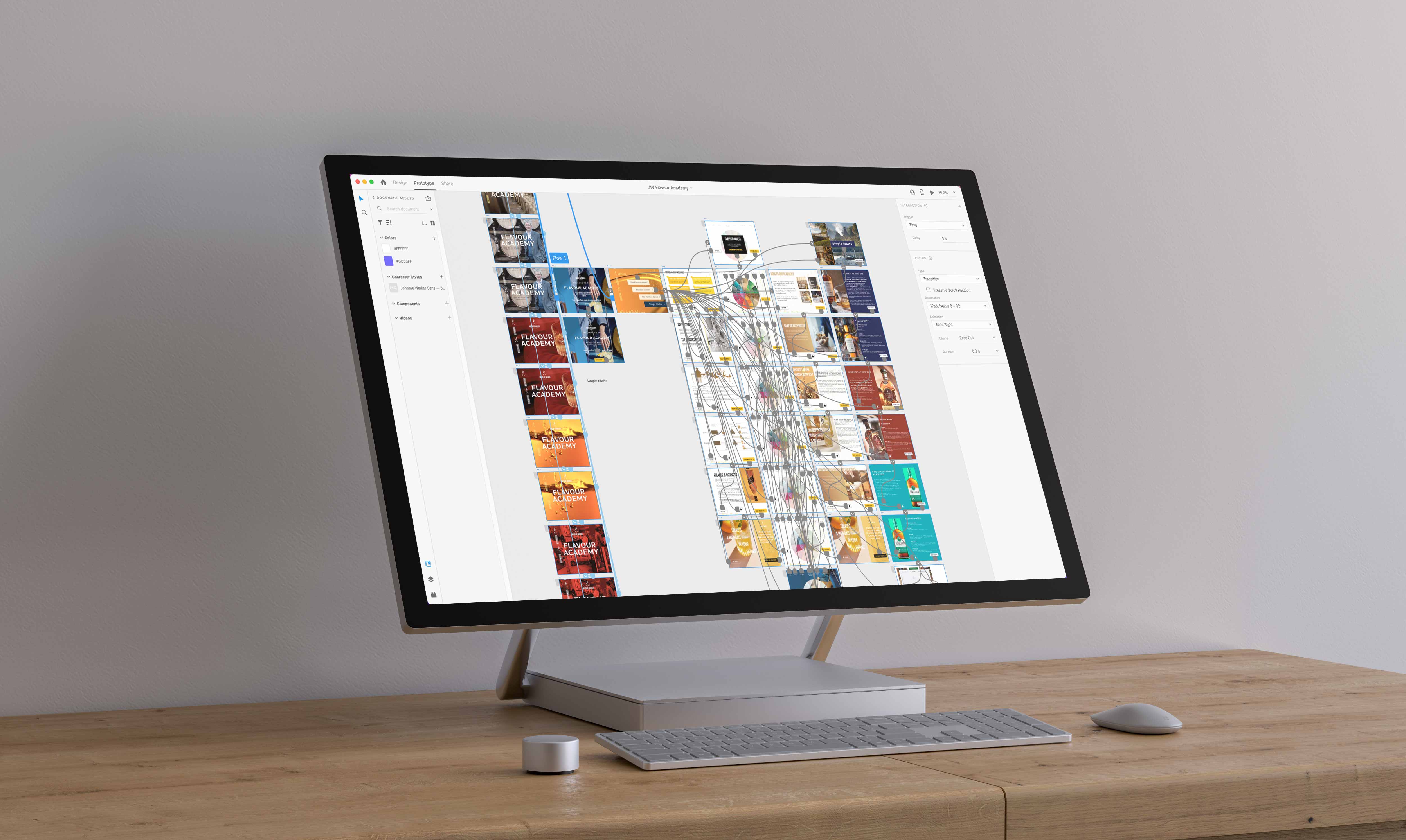
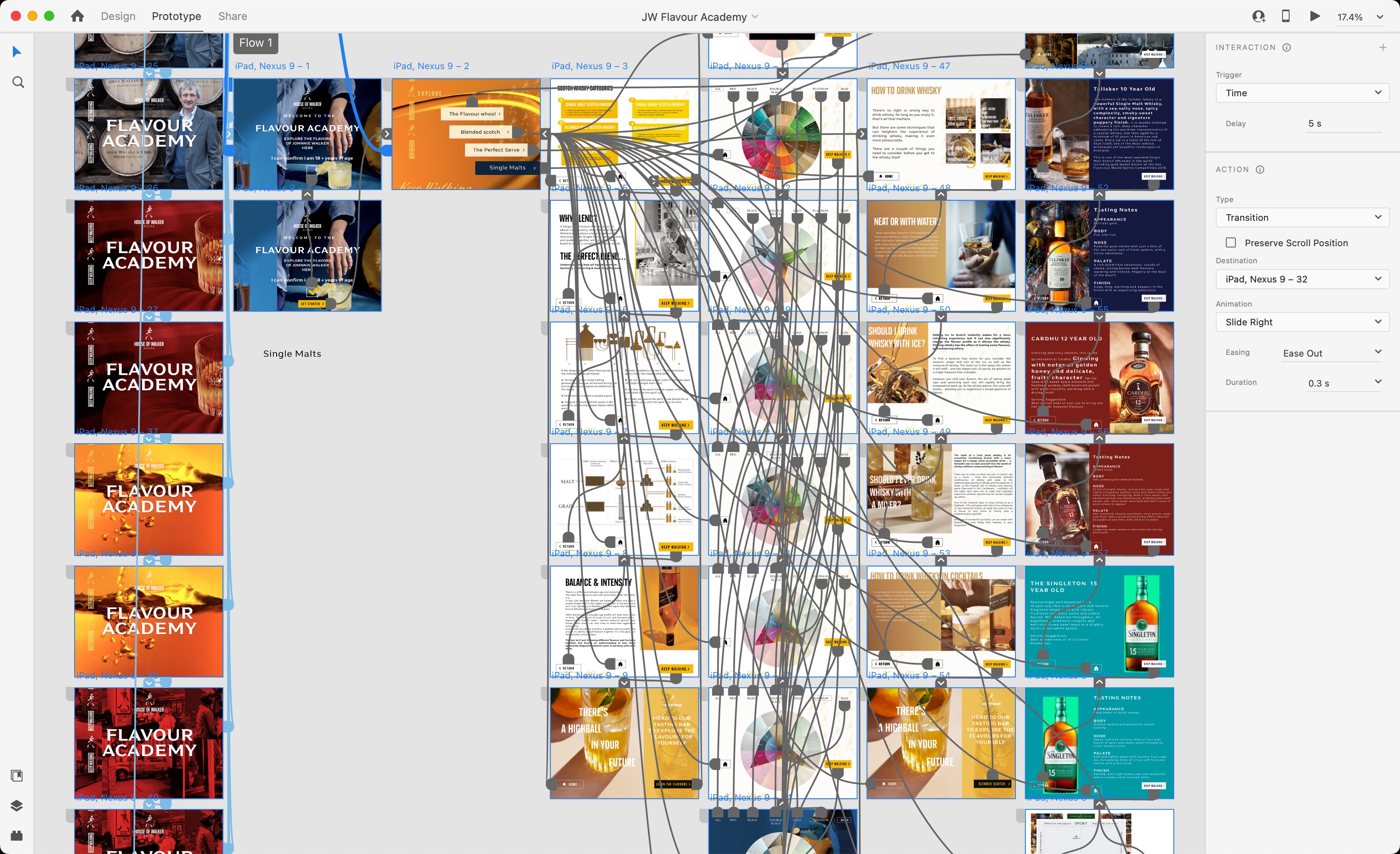
The prototyping phase was executed using Adobe XD, allowing for the creation of high-fidelity, interactive prototypes that accurately simulated the final user experience. Adobe XD’s intuitive features enabled me to design dynamic interactions and seamless transitions between screens, giving a realistic preview of how users would navigate the app.
Using interactive hotspots, I linked various UI elements to demonstrate how users would explore content and engage with educational materials. This step was crucial for testing the flow, ensuring the interface was intuitive and responsive. Animations and micro-interactions were incorporated to enhance user engagement and provide a more immersive experience.
The cloud-based collaboration features of Adobe XD were invaluable during this stage. Feedback from stakeholders was gathered in real time, allowing for quick revisions and refinements. This iterative prototyping process ensured that the design was thoroughly vetted before moving into final development, resulting in a polished, interactive solution that met both user and brand expectations.
SelfSimulation
The self-simulation prototype is designed for visitors to explore and interact with the project independently, offering a hands-on experience that mirrors the full functionality of the final product. Users can navigate through content, interact with key elements, and test features, just as they would in a live environment.
With strategically placed interactive components and real-time feedback, the self-simulation delivers an authentic user journey, enabling visitors to try out feature educational and interactive walkthroughs.
Video Simulation
In the store, the prototype served as a self-guided trial, giving customers the opportunity to independently explore educational interactive tools about the Johnnie Walker brand. By simulating real-world usage, it helps users understand the product’s functionality, while also offering retailers valuable insights into user behavior and engagement with the app.
This in-store experience enhances customer interaction, making the app more accessible and providing a seamless preview of the full user experience in an engaging and informative way.

